People have been asking me to share a bit more about the day to day work that I’m doing now and while I can’t share the actual work due to legal issues, I can share some of the processes use.
A little background
I’m currently the UX Specialist / Lead on a global project for a large corporation, building a business-to-business tool that will be at the very core of their company. The project is divided into 4 business streams and one of my responsibilities is to make sure the product we ship is correctly aligned across all streams.
Projects like this where we have a lot of people involved from multiple nationalities (French, Indian, Dutch, Chinese, and Swedish just to name a few), we have to be very intentional when we consider establishing rules. After all, without well structured, super clear and easy to understand rule sets people will tend to do whatever comes naturally to them - especially as many of our end-users don’t have English as their first language.
Some time ago, I came across a brilliant article titled Making a case for letter case case by John Saito. John works as a writer at Dropbox Paper - a tool I have the utter most respect for (and am using to write this very article!). In the article, John discusses the pros and cons of using sentence casing (e.g Click to read more) and title casing (e.g Click To Read More).
“A little thing like capitalization can actually be a big deal. Capitalization affects readability, comprehension, and usability. It even impacts how people view your brand.”
Applying concepts (and rules!) to maintain brand
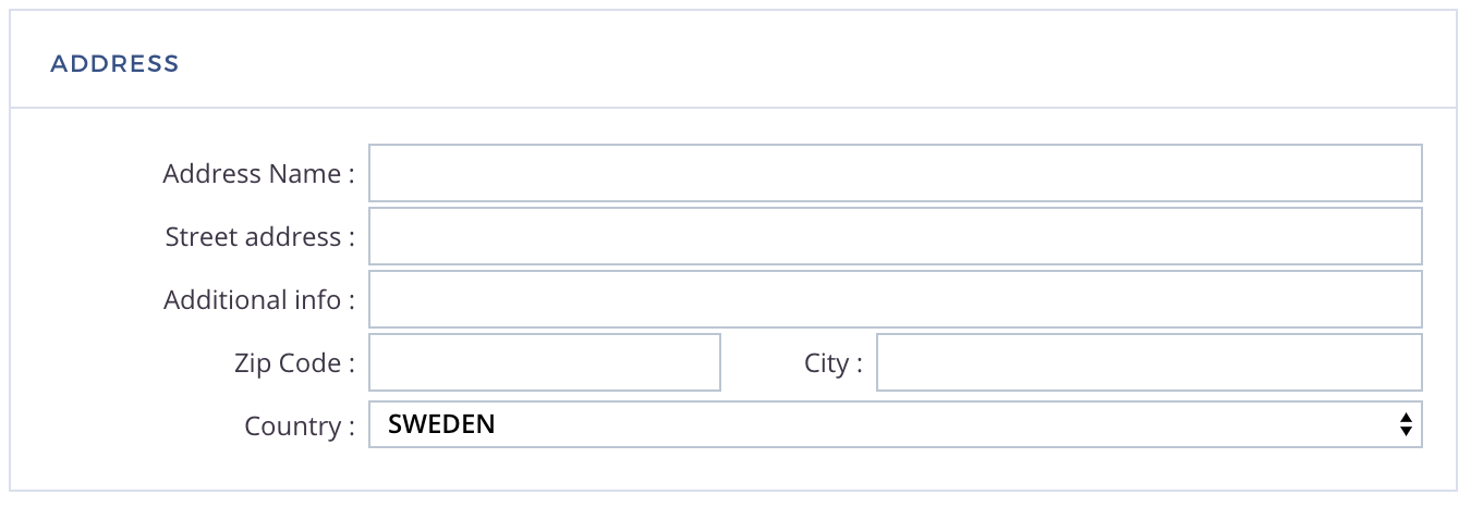
While reviewing the product we’re building it became obvious to me that this was one of the things we needed to set rules on. Allow me to illustrate with an example that I actually found:

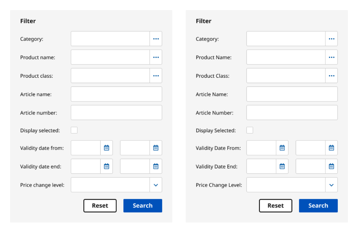
Can you spot the inconsistencies in the writing? This obviously mixes both sentence casing and title casing which is something you should never do. However, multiple developers may have been writing these input fields, so it’s not a rare thing to spot. Small things like making sure that you’re consistent with capitalization may seem like a very small thing, but is something that will have an enormous effect on your users. Because we have a lot of labels and forms like the above, we decided to go with sentence casing. Primarily because it’s easier to read and easier on the eye as there’s more visual balance.
Here’s an example of sentence casing on the left and title casing on the right:

Sentence casing is also ‘friendlier’ and more human, something that this company always strives to be. Our way of writing is always simple, conversational, and respectful to the reader. Besides it being easier to read and feeling ‘friendlier’, we also took into account our team and how we felt there was a need to set easy, unmistakable guidelines:
According to Google’s first UX writer, Sue Factor, one of the main reasons why Google decided to go with sentence case was because it was just easier to explain to designers and engineers. In a product interface, it’s not always clear what’s considered a “title.” Is a tab name a title? How about a settings checkbox? Or a confirmation message?
On top of that, there are multiple ways to do title case. Do you capitalize prepositions like “from” or “through”? How about articles like “the” or “an”? Depending on which style guide you follow, the exact rules for title case can be different. Below are the title case rules according to Apple:
If you have multiple people writing for your product or website, it’s easy for people to forget all the rules when writing in title case. You can avoid this confusion by just using sentence case everywhere. There’s only one way to do sentence case, so it’s harder to goof up.**[Making a case for letter case](https://medium.com/@jsaito/making-a-case-for-letter-case-19d09f653c98)**
The work I do has changed
Just writing about this small part of the user experiences has lead me to thinking about how my career has changed over time. I have been designing websites for 22 years this year. It’s refreshing to see how many different parts there are to building a user experience if you’re just open to it. During these past 9 months I’ve worked in Figma for less than a week because I’ve been focusing on things like this instead. A user experience consists of so many different parts (even things like sentence casing!) so to boiling it down to ‘just design’ would be extremely disrespectful to your users.
I’m extremely grateful and excited about how my work and career will continue to develop in the coming (at least) 22 years I still have to go.