What UX Is and What It Isn’t
Designers seem to be very fond of labeling themselves as UX-designers these days. Perhaps it’s due to the corporate focus on the value they receive when they are attentive to creating great user experiences. While I’ve tried to explain to others what UX-design really is – and what it isn’t – I’ve had the opportunity to reflect on the different kinds of work that I am actually doing. For years, it seemed as though UX-design was equated to wireframes. The deliverables of a UX-designer revolved around these wireframes and they varied quite a bit based on style and purpose.
But wireframes, though important to the bigger pictures, are not the only way for a company to improve their user experience. You see, I’ve found that it is actually rare for me to create wireframes anymore. Most of my days are spent communicating and guiding design decisions to improve conversions through close attention to the experience of the user.
Here’s a few insights into how I actually accomplish these goals and what the deliverables look like. So I can be as clear as possible, I’ll use real cases.
Augmenting Teams with Fresh Eyes
For the past year, I’ve been honored to work with the amazing people at Frank. Frank manufactures, and sells, the best coffee scrubs and recently launched a great new website. I got connected with Frank when a friend suggested that they may benefit from my UX-check.
Frank already works with a great team of very capable designers and developers, Love+Money, who were responsible for the creative concept and development of the new website. Frank wisely figured that a second pair of eyes could help make things even better.

Because they already had designers that created both wireframes and designs, nearly all of my deliverables have mainly been through e-mail. I would look at the existing designs and give them my detailed opinion on how conversions could be improved. It could be really minor suggestions – like the wording in a button and it’s placement, or it could be more complex – like the flow of the shopping cart.
I take the time to do a sweep of the entire experience, desktop and mobile, and highlight any inconsistencies that may derail the experience.
“After going through the initial UX check with Anton and seeing some great results, we realised we needed to engage him further with our new website build. Anton has been across every aspect of the new website build and has given crucial advise in between the the design & dev team and the company directors. His advise has been crucial to the success of the new store.”
Alex Boffa, CEO Frank
User Focused Product/Feature Design Done Right
When I help clients like E.ON with technical solutions, the process is usually multiphase and dependant on the origin of the idea.
- If it’s a feature that is desired by the client, it’ll usually be followed by a process of in depth learning about the system that needs to be implemented and all of its related systems. This can get incredibly technical. I certainly have a greater understanding of electrical consumption and management that I would never have known otherwise!
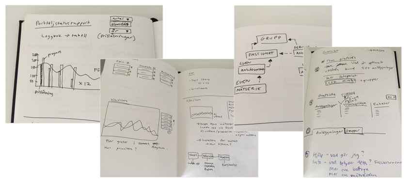
From this meeting/learning process, I’ll head back to my office and assemble a very rough wireframe or sketch about the desired functionality and the flow of the feature. Basically I am nailing down how the user is presented information and all the different options and functionality. These will go back and forth a couple of times until it is well defined as being user friendly enough for the average user, but is still functional enough for the advanced user.

- If it’s a feature/subject or area where I can see a need for improvement, I approach it differently. Even though I’m not generally the target for the product, it’s my job to think like them and consider features that I would have like to see. These are usually presented in an e-mail, during an informal meeting, or using Keynote.
Quick tip: Keynote is a great tool for visually communicating concepts and ideas that don’t have all the features set in stone, something that’s not a wireframe, and that doesn’t necessarily have a flow.
The two advantages I have found Keynote has given me:
- Clearly highlights the problem through a visual medium
- Gives a strong representation of the solution (what is technically possible, economically sane, and represents a focus on improving overall experience)
As an example of this process, the project I’ve been working on with E.ON for the past two years gives a user access to manage and monitor all of their electrical and heating facilities. The user can also manually add these facilities to groups of multiple facilities. Working with groups would give the user more insights, but the way it was implemented made it difficult to create groups and managing them was labor intensive.
Problem identified: Creating and working with groups is too complicated and time-consuming.
The suggested approach was to let the user create dynamic groups themselves. They would be built out of three different parameters:
Geo-positioning (Where the facility is located and expand)
- All facilities in Stockholm
- All facilities that share the exact same address
- All facilities within a radius of 50km of Stockholm
Energy
- Electricity, heat, or gas
- All electrical facilities that have sub-levels
- All gas facilities that are environmentally friendly
Consumption
- My 5 facilities that consume the most
- My 10 facilities that have the most uneven consumption
Solution: Give the user the ability to create dynamic groups.
Using these three group sets makes creating groups easier and yields better information with less effort. An example of a user created group:
A group that features my top 5 facilities in the larger Copenhagen area that consume the most electricity with sub-levels installed.
“What impresses me most is the way Anton understand the underlying needs of the business, and translates that into a beautiful solution. Anton is very easy to work with and he is good at finding the balance between listening and pushing.”
Anna Bengtsson, E.ON
1 Hour Consultations
What I have talked about so far are situations that are long contracts, but companies also work with me on a consulting basis. This usually consists of 1 hour strategy sessions over Google Hangout or Skype and are based around a set topic (on boarding, conversions, design style, or checkout flow)
This is super efficient for the client because they’ll get a lot of valuable information in a really short period of time. There’s usually not a set deliverable, but the take-aways are still very tangible.
As you can see, good UX designers aren’t limited to wireframes. The bigger picture elements play a much larger role than many companies anticipate. When the product features, the user journey, the microinteractions, and the beautiful design are all aligned, amazing things can happen!