A couple of weeks ago, I posted a short excerpt from Basecamp's Shape Up called Wireframes are too concrete. It highlights something that I've been experiencing over the past years, but never really got round to writing about — do wireframes still serve a purpose?
Wireframes are the middle ground. They're not sketches, but they're not high fidelity designs either. They're intentionally designed without color. A wireframe simply attempts to be an accurate representation of layout and information architecture while intentionally avoiding high visual and content fidelity.
The argument around wireframes
So why do we still keep planning for a phase of wireframing in so many projects? The purpose and argument for wireframes often fall in one of three buckets:
- Wireframes focus attention on usability instead of aesthetics. They prevent stakeholders from derailing meetings over irrelevant details like button color and allow user testing to focus on interactions instead of visuals.
- Wireframes are faster to create. They keep things conceptual and avoid the risk of getting too invested or attached to a particular design direction.
- They're a tool for detailed documentation of interactions without the additional overhead of visual design. (for enterprise level users)
Let's we break these arguments down one by one:
1. Wireframes and stakeholders
I think most stakeholders over the past years have evolved a ton when it comes to reviewing and giving feedback on digital products. It's extremely rare nowadays to be in a meeting where the conversation derails over things like button color. And even if they do, any good designer should be able to shift the focus to more relevant discussions.
2. Wireframes are faster to create
When there's a design system available, I find that creating high fidelity designs is faster than creating wireframes. Most of the elements are already created so dragging and dropping them is, of course, more efficient than creating ones from scratch, even if they are just black and white.
With collaborative tools like Figma, the matter is even further simplified. In most projects I'm working on these days, I'll give my client access to Figma and, within days, I can see them trying stuff out. This makes collaboration fundamental in the relationship and takes a lot of pressure out of the meetings and presentations when you've created something together.
3. Wireframes are a simpler tool for documentation
The argument that wireframes serves as a tool to disregard visual design might be true, but that doesn't really make it a valid one. During my 20+ years in this industry, I'm not sure I've ever worked on, or even seen, wireframes that detail documentation of interactions — unless you're talking about 'links', but a high fidelity design absolutely do that.
First of, I don't think I've ever worked on wireframes that transferred truthfully into a visual design without moving or at least slightly re-arranging some of the elements. And if you're moving things around from the wireframes - and hence, breaking the structure and hierarchy that the wireframes were supposed to communicate - then what's the point in the first place?
I’ll give a wireframe to my designer, and then I’m saying to her: “I know you’re looking at this, but that’s not what I want you to design. I want you to re-think it!” It’s hard to do that when you’re giving them this concrete thing.Shape Up
What do I do instead of wireframes?
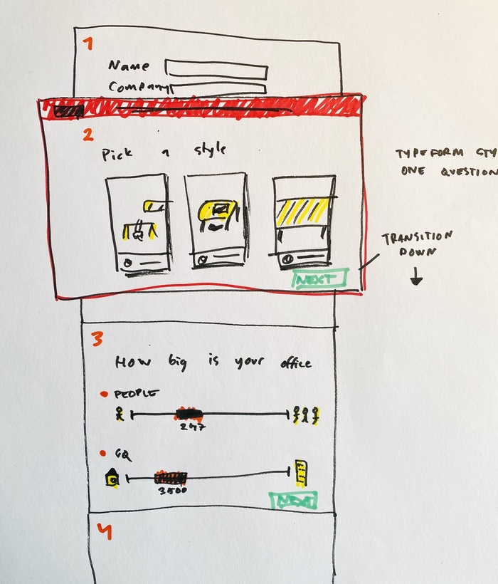
Instead, try sketching. I know what you may say, I can't draw. That's completely fine! If you'd see some of my sketches, you'd understand that you don't have to be able to draw. What you should be able to do, is communicate.

Here's something I shared with my SuperFriendly team. You can see that this is very rough, but you probably get the idea of roughly what I'm trying to communicate. This is arguably much faster than wireframing, and more importantly, it allows the team to focus on their expertise.
Work in the shaping stage is rough. Everyone can tell by looking at it that it’s unfinished. They can see the open spaces where their contributions will go. Work that’s too fine, too early commits everyone to the wrong details. Designers and programmers need room to apply their own judgement and expertise when they roll up their sleeves and discover all the real trade-offs that emerge.
No designer likes to get a wireframe, only to apply color. No developer wants to get a design that doesn't leave room for their own judgement and expertise. Teams that collaborate flourish. When you intentionally leave room for discussion, that's when magic happens.