We can find the terms ‘user experiences’ and ‘UX’ all over the Internet. Just a decade ago this subject wasn’t widely known within our industry and now it seems to be the starting point for anyone interested in design or development. With all this talk, you’d think we’d be able to easily answer the question, “What is a user experience?” Turns out, it’s a pretty complicated question.
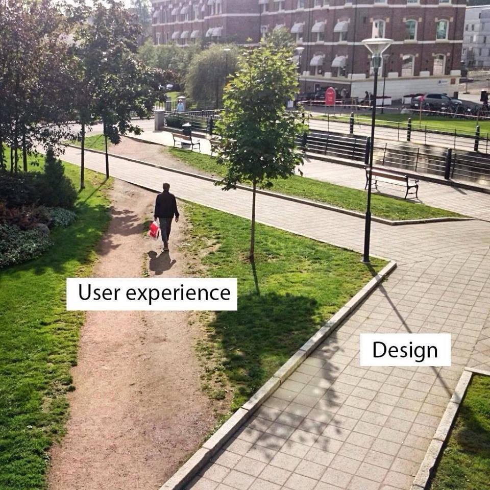
You may have seen attempts that try to explain UX, each more complicated than the last. For instance, this picture has been floating around the Internet for years and people generally agree (incorrectly) that it demonstrates a user experience pretty well.
In fact, this image is closer to the truth.
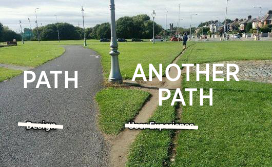
Choosing a dirt road over a paved one doesn’t describe a user experience, but can describe a user scenario - a pattern if you will. A user experience isn’t as black and white as these pictures want us to believe.
Story time
Let me share a story from Jesse James Garrett’s awesome book, The Elements of User Experience, and see if you can relate with it.
Everyone, every once in a while, has one of those days.
You know the kind of day I’m talking about: You wake up to sunlight streaming in your window and wonder why your alarm clock hasn’t gone off yet. You look over to see that your alarm clock think it’s 3:43 AM. You stumble out of bed to find another clock, which tells you that you can still make it to work on time — if you leave in 10 minutes.
You turn on the coffeemaker and hustle to get dressed, but when you go to retrieve your dose of life-sustaining caffeine, there’s no coffee in the pot. No time to figure out why — you’ve got to get to work!
You get about a block from your house when you realize that the car needs gas. At the gas station, you try to use the one pump that takes credit cards, but this time it won’t accept yours. So you have to go inside and pay the cashier, but first you have to wait in line while the cashier very slowly helps everyone in front of you.
You have to take a detour because of a traffic accident, so the drive takes longer than you expected. It’s official: Despite all of your efforts, you are now late for work. Finally, you make it to your desk. You’re agitated, harried weary and irritable — and your day hasn’t even really started yet. And you still haven’t had any coffee.
Jesse James Garrett - The Elements of User Experience
I think most of us can understand how a bad start to a day can result in a downward spiral. It may seem like bad luck on the surface - just one of those days, right? When we look closer, we see how each of the issues could have been avoided through design.
The accident happened because the driver momentarily took his eyes off the road while he turned the radio down. He had no choice but to look down because it was impossible to identify the volume control by touch alone. So much for futuristic touch-screens!
The line at the gas station moved slowly because the cash register was complex and confusing. The clerk spent extra time to make sure he was correct than run the risk of having to start the transaction from scratch - a real possibility. The popularity and simplicity of registers like iZettle and Square is no coincidence.
The credit card didn’t work at the pump because there was no infographic as to which way the card should be inserted. Because you were in a hurry, you didn’t think of trying all orientations.
The coffeemaker didn’t start because you didn't push the button all the way down. The machine itself offers no visual or audio cue that it’s turned on - no light, no sound, and no resistance when the button pushes in. You thought you had turned it on, but being in a hurry, you didn’t double check it. This could have been avoided if you had set the coffeemaker to start brewing automatically in the morning, but you never learned how to use that function — let’s face it, none of us do.
The clock started this whole mess. The alarm didn't go off because the time was wrong. The time was wrong because in the middle of the night your cat stepped on it and reset it. A slightly different cat-proof configuration of buttons and you’d be awake in good time for work - coffee in hand.
Every one of the cases of ‘bad luck’ could have been avoided if only someone had made better choices while designing the products. Take a look around you right now. It’s frightening how many of the products we interact with daily haven’t taken the user into account when they were created. They’re almost ticking time bombs.
User Experience is not about the inner working of a product or a service. User Experience is about how it works on the outside, where a person comes in contact with it. When someone asks you what it’s like to use a product or a service, they’re asking about the user experience. Is it hard to do simple things? Is it easy to figure out? How does it feel to interact with the product?
Choices, Choices
Pull your phone out and look at it. What kind of phone is it? Why did you choose that specific model or brand?
You may have opted for an iPhone because of the design, features like iMessage, or even good old peer pressure. You may love your Pixel for it’s flexibility, configurability, and reliability. But for most of us, it’s something less tangible. We just like how it works. It’s not one specific thing, but rather something more holistic.
UX design is a mix of sociology and cognitive science that looks at how people and products interact. It’s a scientific process that can be applied to physical products like cars, chairs, and tables. In the digital world it simply refers to the way a user interacts with the interface of some kind, be it a website, e-commerce store, or an app.
I don’t know anything about design. Bullsh*t. Look around you. You make choices based on design every day.
Even if you can’t design those things yourself, that doesn’t take away from your ability to decide that was the chair you wanted to sit on, or the shoes you wanted to wear, or the car you wanted to buy.
You know bad design when you encounter it. From every chair you’ve sat in that hurt your ass, to every coffee cup that burned your hand, to every time your finger triggered the wrong link on your phone, to every airline booking site that pissed you off. You know bad design. You hate it.
Mike Monteiro - You're my favorite client
A UX Designer’s role is to look at, let’s say, a website and analyze how a customer will use it and how it makes them feel. They will ask, “How can I make this easier for them to use?” or “How can I make the user’s experience on this website more enjoyable?”
What does UX Design aim to achieve?
- To improve customer satisfaction. Creating designs that encourage positive interactions, you grow the relationship between the user and the product manufacturer/developer. A user is more happy to tolerate mistakes (everyone makes them!) if they feel they have a voice in conversation.
- To improve the interaction between a product and its user. A balance between simplicity and depth of content (features, information) is tricky. Through research, testing, and thoughtful design it can be achieved for the average user - making the interaction feel natural.
- To make sure that the product - whether that’s a website, app, or program - logically flows from one step to the next. Nothing is more frustrating for a user than confusion. When the experience is interrupted, simply stop using the product.
Have you heard about Maslow?
In 1943, Abraham Maslow introduced his theory on the hierarchy of needs. In it, he described what we need as humans to thrive. From physiological (air, water, food) to safety (personal security, financial security, health), love (friends, family, sex), esteem (self-respect, self-esteem), and finally self-actualization (reaching your full potential).
When designing experiences we can look to Maslow for inspiration. Whatever your product is, there are ways to find similarities between the two pyramids.
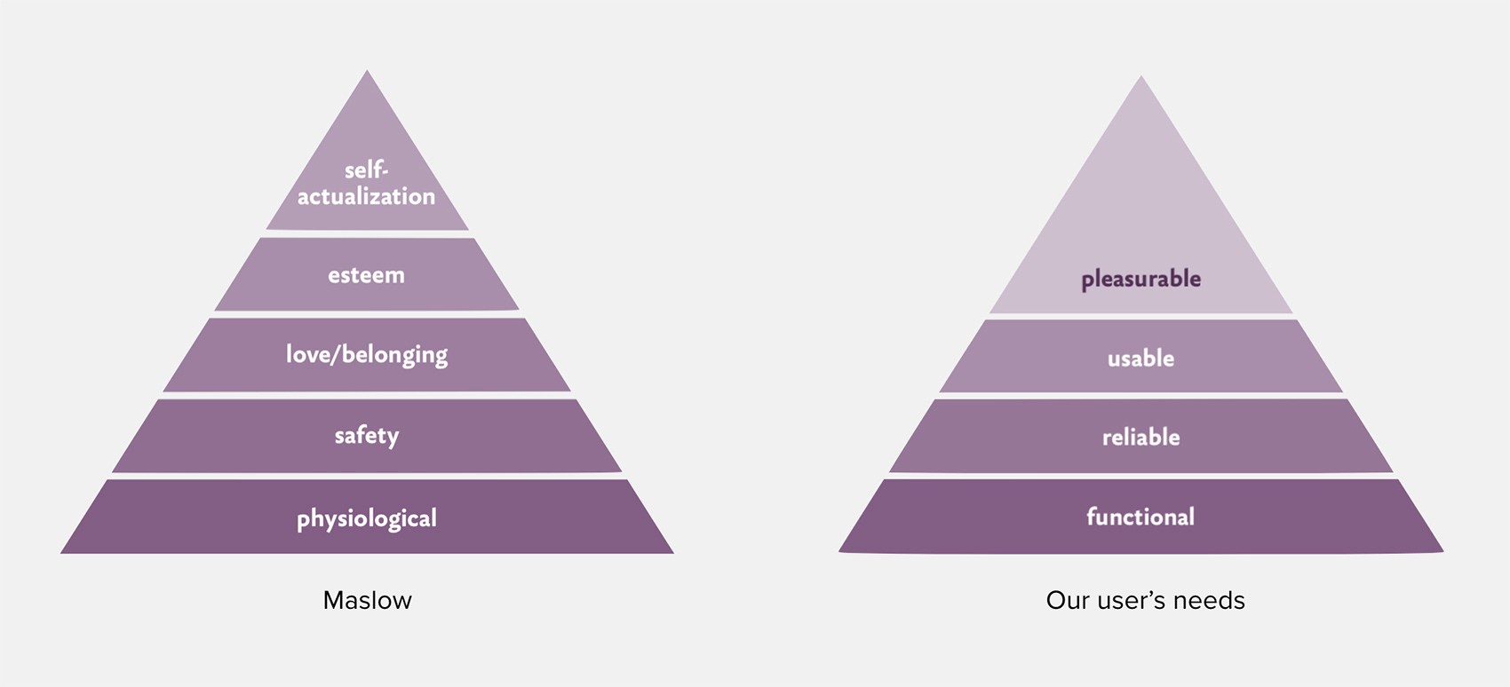
Here’s an example with online banking:
-
Functional: I’m able to login, pay bills, and view an account summary.
-
Reliable: I feel safe using this product. I don’t need to tell you how crucial that is for the banking industry and I don’t consider using anything that even APPEARS to be unsafe. (This is why an even a sketchy website might feel safer to login to using Facebook or Google.)
-
Usable: I’m able to navigate between pages and it functions as I would expect. The features that I expect are all there. The navigation, buttons, etc are using patterns that I’m familiar with. (This is where 99% of all services end, but great UX design goes further.)
-
Pleasurable: I know what you’re thinking – a pleasurable online banking experience? Crazy! It may seem laughable now, but it’s only crazy until someone actually makes one. Then the whole industry will scramble to catch up.
The Extra Effort Goes a Long Way
Great user experiences are the result of putting in the extra effort. When being usable just isn’t enough. Maslow states that when a person is fully self-actualized, they find contentment as their needs have been all fulfilled. A user finds that same sense of contentment using a product that has invested in a great user experience that caters to their needs. That user is happy to be a returning customer and brand advocate.
What are examples of user experiences that brought you pleasure? Is it the first time you sat in a car that had all the features you wanted? Was it the magic you felt the first time you used your fingerprint to unlock your phone?
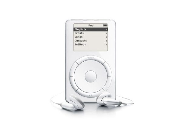
Great user experiences can make you the market leader While some of you may be too young to remember music consumption before smart phones or MP3 players, the world changed when we used the first iPod. Even though it disrupted what was then called the MP3 market by vastly improving the technical specifications – 5GB vs 128 or 64MB – this wasn’t the primary reason for its global success. What made it really stand out was that you could browse a VERY large selection of songs fairly easily (aka the user experience). Remember the Zune? It debuted just after the iPod with similar technical specification, but it’s overly complex interface drove away customers.
Knowing all this, why are there so many badly designed products?
So if it’s obvious that a great user experience is the key to making products that result in happy loyal customers, why are there so many badly designed products out there? It comes down to priorities.
People confuse adding functionality with adding to the experience
A lot of products are focused on what they can do rather than how they do it. They believe they must offer more than their competitors to stay relevant in the market. How do you do that? The knee-jerk reaction is to continue adding features.
A truly great user experience is only created when you have a team that is committed to considering the user at every step. Just throwing features at the user isn’t the answer as they tend to create a bloated, complex products that tire the user.
People think only in terms of visual aesthetics
What looks great doesn’t always work well. A Ferrari might be gorgeous from any angle, but it’s awful when your stuffed in traveling from point A to point B at 40 km/h. It’s functionality and primary purpose is entirely different than of a Volvo’s.
A well-designed product is key to getting people seriously interested. While a Volvo isn’t going to hold your eye like a Ferrari, it’s built to be functional in our daily lives. Driving 40 km/h comfortably with room for kids, groceries, and a spare tire (just in case) is a designed experience.
People think in terms of development/output, not design/functionality
I’ve been on countless web and media projects where the tool was decided long before it’s design/functionality. For instance, if a team hears, “Here’s a brief for a creative campaign, keep in mind that we already purchased the TV spots!” you know they cringe. This mindset results in situations where they are left scrambling to make the design fit the tool.
Instead, beginning with design and functionality saves development time and increases the quality of the product and it’s experience. It’s much easier to pick the right tool using all the information than struggling to get it the tool do what it isn’t designed for.
People think in terms of speed
In startups there’s a culture that moving fast gives you an advantage. Even giants like Facebook choose to “move fast and break things.”
Why breaking things ever would be a good idea is beyond me. While we’re able to move fast in the digital age, it doesn’t mean we should. Crafting great user experiences is hard because it takes time (and effort) to deeply understand the pain points of your users.
People think in terms of financials, not investments
Even though research shows that every dollar invested into UX brings you $2-$100 in return, most companies see it as something that’s “nice to have.” They fail to see the long term value it will bring them.
Unless you’re Apple with a cash reserve of $285 billion, it’s wise to carefully consider how you’re spending your cash. There’s really no set time for when a user experience design is ‘completed’ so being able to identify when it’s ‘good enough’ to ship is one of the key decisions you’ll have to make. I think being good at judging when a product is ‘good enough’ is one of the key reasons behind Apple’s cash reserve.
Let's look at the paths again

Here’s what’s wrong with this image Both of the paths provide a user experience. They provide the user with different user experiences. The dirt path is a shorter path and great in ideal conditions. The concrete path is longer, but is a better choice when it’s raining and you don’t want to jump mud puddles.
Both of these paths are designed. The paved path is designed by engineers deliberately and the other one was designed by users.
Therefore, the picture is misleading and totally fails to explain what UX is, and for no reason whatsoever, puts Design and UX in conflict, and even more so, it smirks and with a smug look puts UX in superior position to Design.
Design is a process, a method, a toolkit, a verb (to design) which is used by people to create various User Experiences. Design is a method, and UX is a desired outcome — outcome based on user research, heuristics, gut intuition, requirements, etc. These two cannot be confronted like the picture suggests.
It’s not even apples vs. oranges comparison, these are both at least fruit, it’s apples vs. rockets level of comparison.Debunking Bad Design Memes, Part 1: “Design vs. UX” infamous pictures
I’m the module leader for ‘User Experience Design and Development’ at Hyper Island this year. The above is my introduction to the course and, for many, the first time they have really considered UX in the real world.