When working on my soon to be released book, User Experiences that Matter, I felt it was important to get people thinking about what defines a great user experience. It really is a tough concept to understand because it is so multi-layered. To help clear it up, I decided to include interviews with three super smart people to get their opinions on what makes great user experienced, great.
…I now realize that I should probably add my voice to the question as well.
How *I* Define Great UX
One of my mottos when working with (digital) user experiences is to always consider the bigger picture. I must confess that my background is primarily in design and it’s my go to, my bread and butter. However, I’ve learned that design can’t – by itself – create a great user experience. As users, we are often misguided into thinking that it’s design creating that experience. It’s much more. I think I put it simply when I talk about user experiences on my homepage:
“The value of your product isn’t measured in its function and design, but in how your customers value the experience of using it.”
I’ve had this same line on my website for years, but it was the other day when I really started to think about how this applies to my own life. What products/services would I label as having a really great user experience? Like I previously discussed in the Values article – it’s all about our expectations, what we’re being promised, and what the product actually delivers.
While my new iPhone 6s is a beautifully designed device packed with great features – the user experience isn’t really different from it’s predecessor. It is faster. It has a better camera. Do any of these things improve my life in a significant way? Not really. Similarly, Dropbox might sync files faster than Google Drive, but that isn’t something that is critical for me as a user – they both sync fast enough.
When we are creating user experiences, we can’t look solely at what we are offering – we also have to understand the user’s situation. Switching to an iPhone 6s from a Nokia 5110 would be a HUGE leap for the user and they simply won’t do it. They will be far more comfortable upgrading incrementally on the platform – Android or iOS – they are familiar with. Taking the user’s situation into consideration FIRST can help you weigh what you’re adding with the needs of the user.
So what product has improved my life in a substantial way recently?
When I was four years old, I was diagnosed with diabetes. Since I’ve been diabetic for most of my life, it’s part of my everyday experience. I have been lucky enough to live in Sweden (and previously Finland) and am assured great medical care and access to free medicine which is critical for me. However, I was always disappointed at how slow technology has evolved for diabetics. We’ve seen amazing apps, devices, and supplies come to market, but very few of these innovations have been focused on easing the struggle of people like me.
Treating diabetes consists primarily of two important steps: taking insulin and monitoring your glucose. While insulin pumps have become more and more common, it’s not something I’ve ever felt the need to have. You have to continually check to see if it’s working – which can be a confusing process – and you still need to keep an insulin pen with you at all times. Monitoring your glucose usually consists of placing a small drop of blood on a sensor connected to a fairly small device. With advancement in technology, we no longer have to wait 2 minutes for a result and some devices can give a reading in just a few seconds. Even with all these advancements, the procedure has not really changed for the past 30 years.
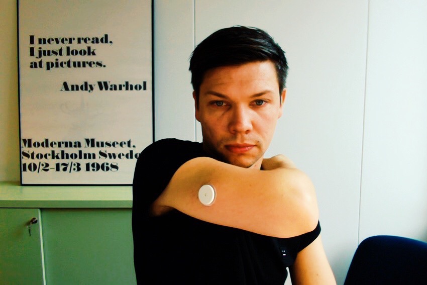
A couple of months ago, I was introduced to the FreeStyle Libre. With this amazing device attached to my arm (usually for two weeks at a time) I can wirelessly check my glucose levels at any time. I just swipe a meter and it displays my blood sugar. I am no longer bound to the process of constantly washing my hands, finding somewhere to sit, pulling out the different supplies, and actually doing the test.

The meter itself is surprisingly similar to what I’ve had for the past 30 years. Sure, it may now have a color touchscreen display and a better battery that is simple to charge (micro-USB), but what makes the user experience great is the difference in how I can use the product.
Due to it constantly monitoring my blood sugar, I am able to quickly see what my levels have been for the past 8 hours, giving me insight into how to manage my condition. The people at FreeStyle Libre didn’t just create an app, change the interface, or improve the device – they rethought the whole process of monitoring your glucose. They focused on living WITH diabetes. They’ve identified my pain points and acted on them.
Emil Ovemar from Toca Boca shared his thoughts on what creates a great user experience:
“…it’s about a getting that personal connection – that the person that created this product created it with me in mind.”
(read the full interview in User Experiences that Matter)
In order to create truly great user experiences, we need to rethink entire processes of our industry. Uber didn’t just launch a more user friendly taxi app, they disrupted the entire industry. That’s what made Uber a success – the simplicity and design of their app is just a result of that initial disruption.
So, instead of doing yet another redesign, think about how you can RETHINK your industry.