One of the first things I like to do when joining larger projects is to research if there's any UX strategy in place. You might not be familiar with the term, but be assured you aren't alone - which is why I thought a post like this was needed. The tl:dr of it all is that it's a document that should outline the goals and guidelines when it comes to UX. Think of it this way - it's nearly impossible for teams to be the best at everything, so we need a way to align our priorities and focus on delivering the best possible experience in the areas that matter the most to our users.
In my previous role, I was the UX lead for the team behind Apotek Hjärtat, Sweden's second largest pharmacy, and I'm currently leading a team for a massive retail giant. So while the companies and products we serve may be completely different, one thing they both benefit deeply from cohesive UX strategies.
What's a UX strategy?
In order to explain what a UX strategy is, I usually start by separating the two words. In order to make something, we need to make sure we understand what it is that we're making down to it's parts. And for both UX and strategy there are a gazillion explanations so let's start by looking at the definitions as I understand them.
1. UX
When someone asks you what it’s like to use a product or a service, they’re asking about the user experience. Is it hard to do simple things? Is it easy to figure out? How does it FEEL to interact with the product?
User Experience is not about the inner working of a product or a service. User Experience is about how it works when a person comes in contact with it.
One thing that I often come across is a very distinct focus on features. It makes total sense right? Of course you have to focus on what the product should do. But there's usually two risks with this approach. The first one is that there's a risk of assuming that more features will equal a better product. It'll solve more problems with more features so that's for the best, right? If you think about the products you truly love, I'm sure you'll see that there's usually a pretty tight focus on a couple of things instead of there being a glut of features. So, I guess less is more in many cases*.*
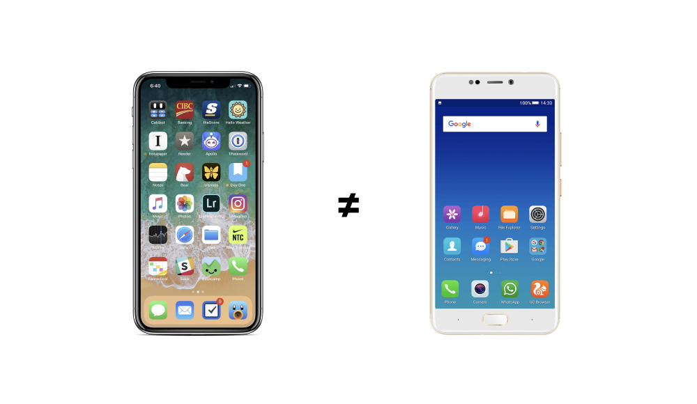
Secondly, describing features runs the risk of focusing on what but not how. I realize that this is a bit harder to grasp so I try to offer real-world examples that my team are familiar with. Here's one of the images I use as a discussion point:

Most of us are familiar with both iPhones and Android Phones. Most of us also have, for one reason or another, a strong preference. Why? If you look at their features, they are, more or less, identical. You can make calls, browse the web, send emails, listen to music - the list goes on and on. Most third-party apps are even available on both platforms! Even so, most of us would not consider switching if asked. Why? Because of how they work rather than what they do. So clearly, how something works can play a huge role in your product's success (just ask Tim Cook).
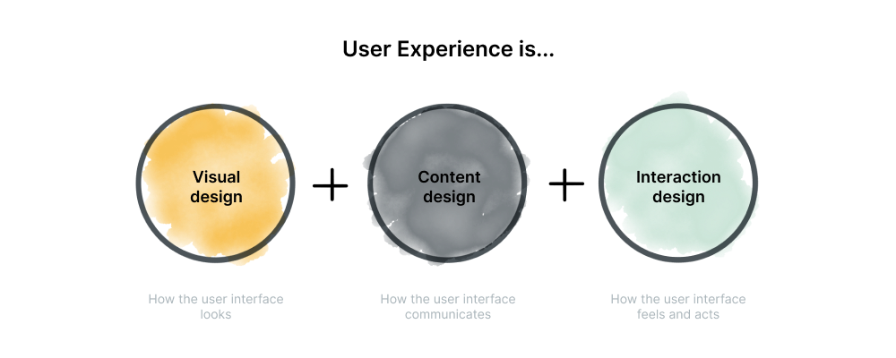
I like to say that the user experience is primarily made out of three different things:

- Visual design - Not long ago, this is what most people assumed was the user experience. How things look. Even when Material Design was first launched, the discussion was primarily focused around how it looked, not how it should be adapted, combined with words, or the interaction!
- Content design - During the last year, there's been more and more discussion about the importance of UX writing (even by yours truly). This is not just because of a sudden trend, but more because words play a crucial role when creating a user experience. Written content is a great way to add personality, but also a way to remove friction and insecurity - the stepping stones of good UX.
- Interaction design - How a button interacts with you when you hover over it or press it is not merely visual design or eye candy (more on the importance of eye candy in a coming blog post) its a way for the application to communicate with you - I'm responding to your actions - and ideally, I'm responding to them quickly.
2. Strategy
A strategy is, briefly and overly simplified, three things.
-
Where are we now - It's of course critical to first understand your current reality. Understanding your current situation is vital to identifying what you need going forward. This includes an analysis of several areas.
- Customers – What are their current and future needs? What are their perceptions of our performance?
- Competitors – How do we stack up against our competitors? What are their recent and anticipated initiatives?
- Industry trends – What recent shifts have there in our industry? What shifts are anticipated for the future?
- Performance trends – How are we performing by product, by market, by channel?
- Employees – What are their perceptions of our organization and how we can improve? How can we make them more effective in their roles?
- Organization profile – What are our strengths and areas for improvement with regard to our organization structure, processes, technology, culture, etc.?
-
Where do we want to be - Positioning statements can help outline future direction. However, the full business strategy must take a comprehensive approach to addressing goals (broad aims) and objectives (specific, measurable targets).
- Goals
- Objectives
- Positioning statements
and even very high-level things like:
- Vision statement
- Mission statement
-
How do we get there - Once the strategic direction is established, the next step is to develop the road map for getting there. Personally, I think it makes sense and is beneficial to be as specific and hands-on as possible in this step. What do we (practically) need to do in order to get there? Change roles within the team? Are we missing a required skill set? Are our ways of working standing in our way? I'm a sucker for improving the ways of working so I love helping organizations with this step :)
Ok so now we've outlined what we mean by UX and what we mean by strategy. Then let's see what else I like to include in a UX strategy. It's worth noting that depending on your team and your situation, your mileage may vary.
Defining your goals
As I've defined my take on what UX is and what makes a good user experience, it's time to define what goals we have - what should we aim for to call the results a success. Goals are principles, desired outcomes which I think are far better for a strategy than an action plan (features and to-do's).
Your goals will (naturally) be specific to your product and team, but some of the goals I've worked with in the past include:
- Design for everyone - we should design features and a product that serves and focuses on the majority of our users (>80%). Too often companies listen to every individual request and add feature after feature just to please individuals when in reality, every added feature adds to the complexity that can shortly become outrageous. This also ties into accessibility. Instead of just designing a solution, have an open and honest discussion on what your goals are when it comes to accessibility. When I've worked with state funded organizations and municipalities, accessibility isn't an option - it's a requirement. Clearly define what that requirement should include (and aim higher).
- Optimize for speed - most products, whether it's the checkout of an e-commerce platform, an email application, or a business-to-business fulfillment solution, it will be judged by the speed at which it operates. People like to think that this is an engineering issue and while that may be true to some extent, it highly affects the user experience which makes it your one of your highest priorities.
- Different is good - try to visually clearly distinguish key actions and place them logically. When designing a checkout experience, it's obvious that the checkout button should be prominent. Well it turns out that all products have these primary actions that we want our users to do. Distinguishing them makes it easier for users to scan the page and quickly identify what to do next. Insecurity is the root of all bad user experiences.
- Always put the users first - It's not unlikely that your users will spend the majority of their time in other applications so when you're designing your experience, look for common design patterns that are used either globally or within your industry. The fact that Google Docs looks and works a lot like Word is not a coincidence nor is it necessarily the best design pattern but it is what users that start using Google Docs are already familiar with. Familiarity creates security and confidence.
It’s counterproductive and wasteful to recreate basic components and patterns for every new government website. We should encourage building from a common collection of practical solutions that reflect modern best practices. Enable teams to focus on the their users and their mission, and less on reinventing existing solutions. Do less to do more. United States Web Design System Design Principles
Changing the way we work
In a lot of projects that I've worked on, there's been a defined period of time for 'UX', but while there are periods that require more work than others, creating an experience is a continuous effort.
Some would say that investing months iterating an interface/user experience might be too expensive, but it is probably the most cost-effective way to build a great product. The real failure would be having developers build something that’s not the best solution to your problem. Turns out, an estimated 50% of engineering time is spent on reworking that could have been avoided. What’s even more terrifying is that fixing an error after development is up to 100x times as expensive as it would have been before. The old adage 'work smarter, not hard' really does ring true, doesn't it?
Establishing, and paying special attention to, that UX strategy from the beginning of any project, large or small, will be your saving grace. It will give you that baseline of goals and guidelines so that you and your team don't experience any confusion (brand, expectations, objectives, etc.) while going on to do the best work possible at every moment. Getting that great final user experience begins with a great UX strategy!
Have you just read this post and thought how awesome it would be to get your company's UX strategy perfect? I've got some availability I set aside in August just for you to make that happen! Reach out to me and let's start talking about what you do, what I do, and what we can do together.