When we're designing digital experiences, we focus on the big stuff - the overall experience. We discuss things like information architecture, user flows, research, and visual identities. When we're working with an e-commerce solution, we discuss the full checkout experience, but rarely discuss the things that will actually make our users remember us - and even talk about us. This makes perfect sense, because the checkout experience is what will make the meal. But in order to have users that love your experience, we need to offer not just the entrée, but also candy. Confused? I get that. Let's back up.
Perhaps you've heard the expression "God is in the details" which was said by Mies van der Rhoe, mid 20th century architect. Mies, famous for being one of pioneers in modernist architecture, is often associated with his fondness for the aphorisms, "less is more" and "God is in the details".
"The devil is in the detail" is an idiom that refers to a catch or mysterious element hidden in the details, meaning that something might seem simple at a first look but will take more time and effort to complete than expected and derives from the earlier phrase, "God is in the detail" expressing the idea that whatever one does should be done thoroughly; i.e. details are important.
If you're interested in creating great user experiences, you already know the important part well thought out details can play in the experience of a product. Do you remember that first time you "slide to unlock" an iPhone? Then, years later, you were mesmerized by TouchID. While these may feel like features and not details, they all have details that make the feature. Whether it's that little click sound or the animation that follows, the entire experience is based upon those details.
What does this have to do with candy?
I was watching Malcolm Gladwell over at Masterclass (a great class - highly recommend it!) and he talks about how every story needs candy.
Candy, in a story, is stuff for people to talk about. The fun stuff. The meal is the thing they dwell on, and take home and process on a much more meaningful level. And it's totally fine to have candy as long as you have a main meal, as long as you have the entrée. It's a bad idea to have candy and no entrée, but also a bad idea to have an entrée and no candy.Malcolm Gladwell
I think this is a far better analogy for what we want than just talking about 'details'. Details are easy to ignore when time gets short. Details are unnecessary. They become an expense that's hard to see when considering ROI. Details are the antithesis to the MVP, the darling of Silicon Valley.
Unfortunately, when time is short we tend to cut out the candy in order to not mess up the entrée. And sometimes this makes sense; the candy won't be worth anything if the entrée is uneatable. Maybe we should instead think of candy as something that could take an ordinary entrée and transform it into a great night? Isn't that really the experience we want to design?
"The details are difficult to include when you’re building a product; they’re expensive both in terms of time and technical overhead — which is why they’re rare."
God is in the details - Buzz Usbourne
Candy comes in all forms and shapes
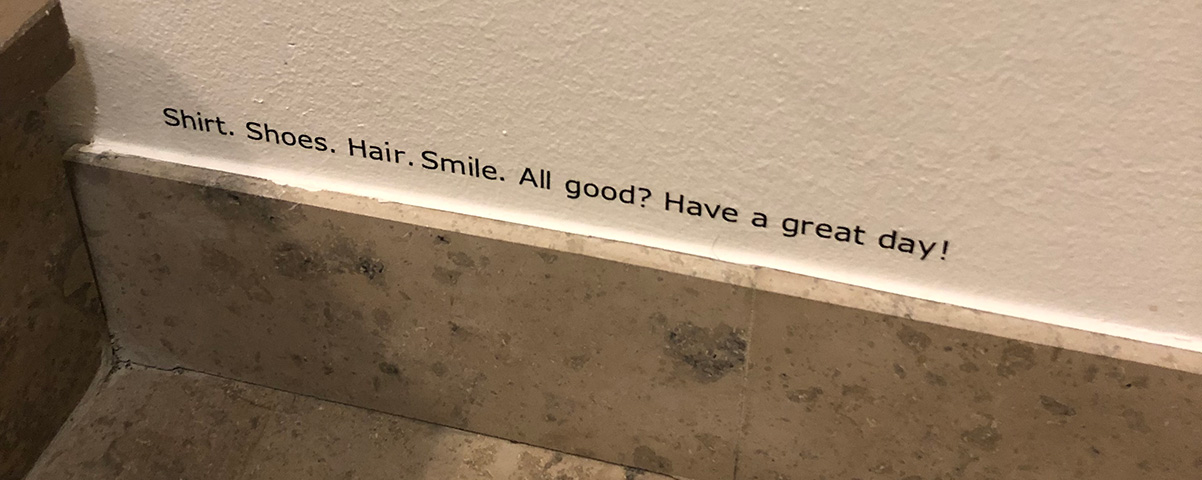
Candy is interesting because it can come in so many shapes and forms. Sweet or sour, large or small, thick or like jelly. As you may know, my commitment with IKEA is over, but my time with them offered me an example of candy that I love (I think IKEA does candy really well). Their offices in Malmö have 7 floors. While I usually took the elevator, I occasionally took the stairs to get some office exercise. Right above the baseboards there were small messages printed. They were very discreet and it probably took me a couple of times running up and down the stairs before I noticed them. After that, they always brought a smile to my face.

It's such an easy thing. It doesn't cost much. It's not difficult. The result? You improve your co-workers' days, making them happier, more engaged and active. That's priceless.
The thing about details - sorry candy - is that it works best when we're not expecting it. The unexpected treat is the best one right?
Surprise sometimes. You’ve heard of dopamine, right? The reward chemical? Here’s some news: Dopamine isn’t about the rush from the reward. It’s about the good chance of a reward happening. We love that uncertainty. Therefore, let your words surprise sometimes, but not all the time (think of the flying Asana unicorn or Slack’s random welcome messages). Bam!A UX Writer’s Journey Into the Deep … Parts of the Brain, and 3 Insights From It.
What's your favourite candy?
When you start looking for candy, you'll notice that it's in places you've never expected. You can almost make a game of it! There's even a great little website, Little Big Details, that showcases small pieces of candy from all of the websites and software you probably use on a daily basis. (like what about this one from Google Forms or this one from the Invision Blog)
What's your favorite candy? I would love to hear about it!