Not too long ago, people were cautious about buying nearly anything online. Books and DVD’s seemed to be the first things that people began buying using e-commerce websites. I believe that’s because most people were confident they knew what they were getting. A book is a book. You are confident of what it looks like, and its quality, and with its low price point, the buying risk was reasonably low. Probably most importantly, you don’t rely on a book for much of anything as it’s not vital to your everyday life. We must remember that with any transaction online (or not), basic criteria need to be met for you to purchase anything. These are usually based on two things - relevance and trust.
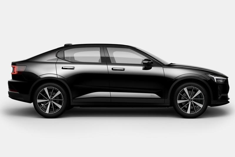
Today’s purchasing habits are a bit different. Online shopping no longer restricts itself to books and DVDs but purchases groceries, clothes, beauty products, meals, and so much more. We’ve even started making major purchases like cars and houses! I wanted to talk about my recent online purchase, my new car from Polestar.
For those unfamiliar with Polestar, it’s a relatively new brand in the Volvo “family” but operates independently. They currently only offer one model, the Polestar 2 - they previously offered a hybrid called Polestar 1 - but Polestar 3-5 are all under production. The Polestar website is very clean and straightforward, just as the UI in their car is - all built on Android Auto, a departure from most car makers who develop their own tech.

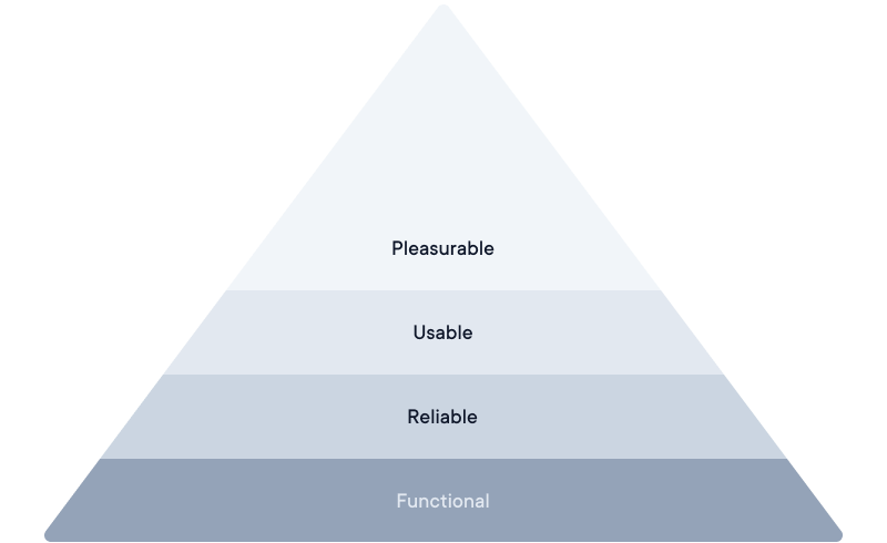
The pyramid of user needs
As avid readers of my blog are familiar with, I often refer to Maslow’s pyramid of needs applied to our user experiences. The idea is that to craft great user experiences, our products need to be:
- Functional - basic actions are available, and I can execute them. So, it doesn’t matter how beautiful your onboarding screen is if I cannot log in to your product.
- Reliable - I can execute the same action over and over with the same results, i.e., I can always login.
- Usable - I can understand how to perform the critical actions without instructions. Labels are clear, tap areas are large enough, and the experience works.
- Pleasurable - the product is a joy to use. This can be difficult to achieve and something that every product owner needs to weigh. If you spend too much time making it pleasurable, you’ll risk making something that isn’t genuinely usable and, worst case, not even needed by your customers. But if you spend too little time making something pleasurable for the customer, you’ll end up with a dull project, and while you might get users, you’ll never get loyal users.

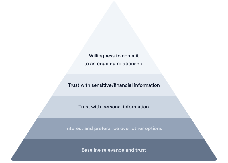
Similarly, when thinking about the experience of buying something like a car online, it’s important to think about this other pyramid (funnily enough, also based on Maslow’s pyramid of needs!) - namely, the pyramid of trust.
The pyramid of trust
The pyramid of trust is something that NNGroup first introduced in 2016 and highlights the five distinct levels of user commitment a website will need to meet for a user to trust it. I run into this over and over in projects - product managers want to get as much user information as possible. A great example is email pop-ups on websites. The website is asking for your email address, but because the pop-up appeared immediately and above the website, you haven’t had time to receive any value. No, thank you. If things like this work, it’s only because a website uses these pop-ups to trade your email address for something else you may value, like 10% off your first purchase or a free PDF download (sigh). I’ve made tons of these during my career, so I’m not saying they are all bad; I’m just saying I don’t think they are the correct path to creating a pleasurable, trustworthy relationship with your customer.
If you ask a stranger on the street for a favor (or their email address!), what would you need to give them to gain their trust? Skip any of those trust-building steps, and the person walks away - or, on the web, leave the site and try somewhere else.
- Baseline relevance and trust - Can this site help me accomplish my goal? Is it credible enough for me to trust this information? Does it seem to have my best interest at heart? In my case, the Polestar website comes across as credible, and I had no reason to believe I couldn’t trust the information presented.
- Interest and preference over other options - I couldn’t choose another website as the car can only be ordered online. However, I could have decided to buy another car online (Tesla, etc) or gone to a dealership (Volkswagen, etc.) and ordered a car the ‘old-fashioned’ way.
- Trust with personal information - Is this site’s offering valuable enough to justify the time and effort to register and provide my personal information? Do I trust the site will treat my information responsibly? Do I want emails from this company? It turns out, I did—more on this below.
- Trust with sensitive/financial information - I did not actually have to give any financial information to order a car (WHAT!). However, I still had to provide it with sensitive information, allow them to run a credit check, etc.
- Willingness to commit to an ongoing relationship - Again, as I was purchasing a car, I knew that it would be an ongoing relationship (service checks etc.)

Designing a pleasurable experience starts sooner than you think
I’ve always been surprised by how many of the high-end hotels, Michelin restaurants, and high-end travel options I’ve experienced have struggled with their entire user journey... Sure, the actual experience - staying at the hotel, dining at the restaurant, flying in business - is excellent, and you can tell that they’ve spent a lot of resources crafting a great experience. BUT that it’s the entire experience. A hotel may have a well-designed website that makes you desire to make a reservation, but the actual booking experience is almost always handed off to third-party services that are often far from pleasurable. Functional? Yes. Reliable and usable? Usually. Pleasurable? Never.
So far, Polestar has been excellent in this sense and crafted one of the best pre-experiences I’ve ever encountered online. It comes as no surprise that once I completed my order, they sent me a confirmation email (Subject: You’ve made a great choice). But what made me enjoy the experience are the emails they’ve sent me over the following weeks:
- Confirmation email
- We’ve started building your car (with pictures from the factory and a timeline)
- Your car is built and waiting to be shipped (with pictures from a parking lot full of Polestars outside an harbor)
- Your car is on its way
While this might seem like a low bar to meet to get someone excited, very few companies actually meet it. You see, what most companies tend to do is they focus everything on the actual experience of their product (the car, the hotel stay, the dinner etc.), but I’d like to see more communication like the ones from Polestar. One that manages to keep my excitement up throughout the entire waiting period. From order to delivery, it will be nearly six months. While the wait might not be quite that long for a great hotel stay or an amazing restaurant visit, it’s not uncommon that it could be months of planning and preparing. So why let the excitement your customer feels when they hit that Reserve button on your website fade?
Crafting an email sequence is a low-cost investment that helps you grow your delighted users into brand ambassadors. There’s a sea of possibilities for keeping - and increasing - excitement between purchase and the actual delivery. So why let that go to waste?