We’re a few months into the new year and I can’t think of a better time for a fresh start. So this year, I’ve chosen to be more mindful about my business. You all know it's just me on the payroll - and no plans of changing that! - but I think it’s time to better communicate what services I offer.
A colleague recently mentioned to me that I use the word 'dynamic' a lot when talking about my designs. Perhaps it's fitting then that my business is just that… dynamic. I can work with your team by myself. I can assemble an all-star team for you. I can work with you on a one-hour, one-time consulting call. I can work with you for many years. This flexibility and adaptiveness is crucial to my business, and it's why I love running my own business. It can also be hard to communicate.
When I started my career, I did everything by myself. I designed my logo, created and coded my website, and uploaded it via FTP (remember that?). However, as time passed, I realized I needed to reassess my priorities. Although I believe I run my business professionally, there has been one area that I have overlooked until now: a strong visual identity. Like I said, I used to do everything for myself and my clients - visual identities, design, marketing, UX, and even some coding! Now I realize, and tell all my clients, that they should hire professionals specializing in the task. The results are much better and the price is usually lower in the end!
Now I’m following my own advice. It was time to work with a brand designer to create a logo and visual identity for me. I’m lucky to have a strong network of talented designers, but finding the right one still proved to be a challenge. Ultimately, I chose to work with the talented Christina Hanna.
I first met Christina when I was interviewing potential freelance designers for Product. Though we didn't have the chance to work together then, I was impressed by her portfolio and professionalism. When collaborating, having the right vibe is crucial for me. It doesn’t matter which side of the table I'm on during an interview, my vibe radar is always on and tuned in.
When building Antons brand, I wanted to understand the emotions and impressions people were left with when working with him. After all, that’s his brand!
I was amazed by the very clear patterns that emerged throughout all of Anton’s testimonials. People are consistently enthusiastic about his collaborative, inspiring, and warm nature, as well as his structured design thinking. The testimonials became a foundation for his identity and a way to embody the key characteristics that make people want to work with Anton again and again.
The clear patterns in Anton’s testimonials were a goldmine of inspiration for his identity. They became the foundation for capturing his collaborative, inspiring, and warm nature, and his structured design thinking.
Anton is a rare blend of warm and precise, which makes him exceptional in his profession. We wanted his brand to embody this duality and showcase what makes him stand out.Christina Hanna
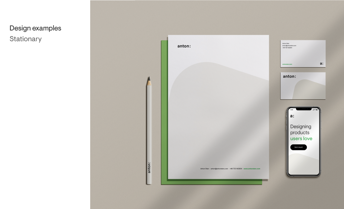
Christina got to work and over the course of a few weeks, she developed a clean yet flexible identity for me. Once the key pieces were in place, we collaborated on the website, which is obviously the main attraction for someone like me.
In my opinion, a visual identity should convey the story of the brand. Ultimately, a brand is defined by what people say about it. Fortunately, I have been collecting testimonials for years, and certain characteristics shine through. The brand is adaptive, explorative, collaborative, and structured. These are the values that I want the visual identity to communicate easily and effectively.
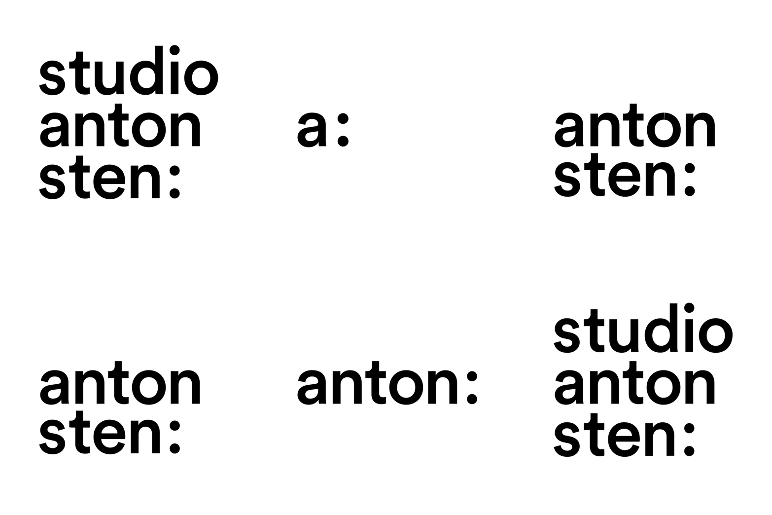
One logo, four takes
In creating Anton’s logo, I wanted to capture the essence of his multifaceted work and approach to design. The colon after his name represents the various creative endeavors Anton is involved in. Whether he’s writing, collaborating, or designing, the logo communicates his versatility and adaptability. The logo can also be presented in different lengths and abbreviations, from “anton sten studio:” to “a:“, showcasing his focus on minimalism and effective communication.
I wanted to embody the duality of his warm, collaborative nature and his precise, structured approach to design - key characteristics that make him stand out as a talented and exceptional professional.
The soft square embodies the qualities of adaptability, collaboration, and warmth that are so integral to Anton’s approach to design. The shape has a natural and fluid form, symbolizing the flexibility and creativity that Anton brings to his work.Christina Hanna
One thing that I love about the logo are the variations it comes in (shown in this cool animation):

As a freelancer/consultant/one-man agency, I love the variety of projects I can take on. Some clients choose to hire me for an hour to coach them or to give a gut-check on a new feature they're about to launch. Most clients hire me to slot into their existing team, whether that's a small startup or an large agency. Even others want me to assemble an all-star team of professionals! To me, this is what the logo variations communicate.
- a: one hour
- anton: part of your team
- anton sten: leading a project
- studio anton sten: all-star team
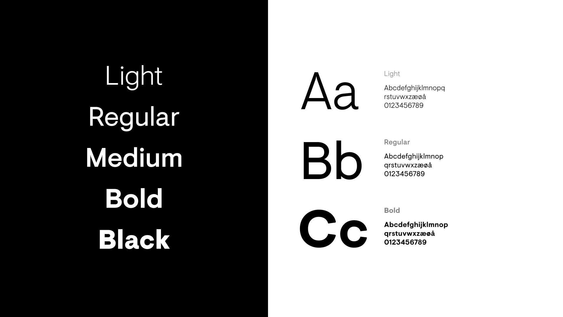
The Visuelt typeface captures the balance between Anton’s warm and human approach to design and his precise and structured attention to detail. Additionally, Visuelt has Nordic roots, which adds a subtle nod to Anton’s Scandinavian heritage and culture.Christina Hanna
More visual
Although I still prefer to articulate my thoughts and processes through writing, I am realizing that much of my work is best communicated visually. This realization has required me to develop a more conscious visual style, and it has also forced me to create a couple of portfolio cases at last. Proud to show the work I've been doing the past years, including the variety of work for Zabka, Toast, Loom, Summer Health, and more.
Team effort
The new website is the result of a team effort by Studio Anton Sten:
Christina Hanna worked on the visual identity, Karolin Gu helped with the case videos, and Alexander Hansson assisted with rebuilding the website, as always. Finally, Josh Yuhas (whom I've worked with for almost 8 years now!) edited the site's text. The best results come from working with the best ❤️.


