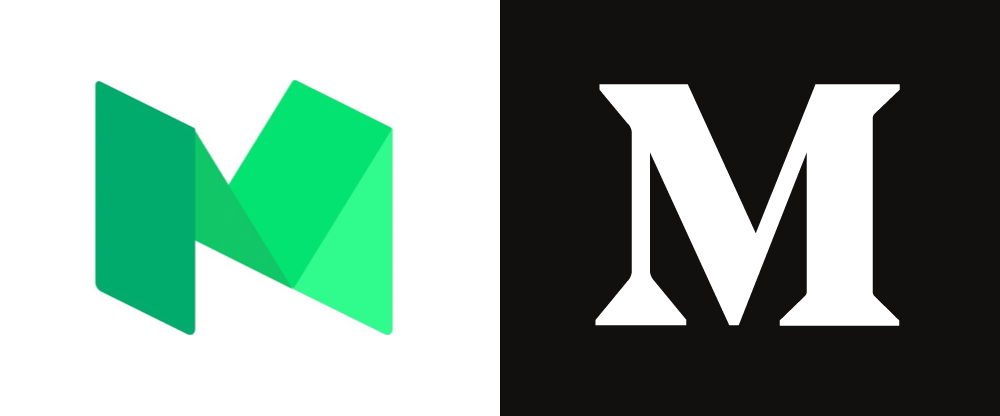
This change is somewhat perplexing because — regardless of whether you liked the old green, isometric monogram or not — it had become easy and quick to recognize and effectively signaled when you had landed on Medium if you found yourself clicking around the internet. After two years of building on that green “M” now they have to start all over again with a design that’s on the complete opposite end of the spectrum and… why? So that they can throw it away in another two years? Sure, the internet — perhaps, especially, publishing on the internet — is a constant battle of How-the-Fuck-do-we-Monetize-this-Shit that makes services appear, disappear, or change but it’s random shifts like this that add to the situation.
Brilliant review that encapsulates my thoughts far better than I ever could have. And also, did you know that I post most of my blog posts on Medium too?