I recently had the opportunity to be interviewed by Adobe Creative blog on how I create meaningful user experiences. During that interview we talked about a lot of different things, but it mostly revolved around topics that I discussed in my book, User Experiences that Matter. A few years have passed since I wrote it, but I’m pleased to see that it continues to give it’s readers value. One of the things I discuss in the book is the extra mile that’s required to create a user experience that’s actually enjoyable. If you haven’t read it already, you can find the essence of it’s in one of my older posts called The Extra Effort for Great UX.
One of the perks of writing and why I think all designers should write is that it focuses us to not only validate our thinking and designs, but it gives us the opportunity to re-visit our thoughts from the past. Do these thoughts and ideas still hold true? If not, then why? I’ve found that while I think we should still strive for enjoyable experiences, enjoyable might not in fact be the best word to describe it.
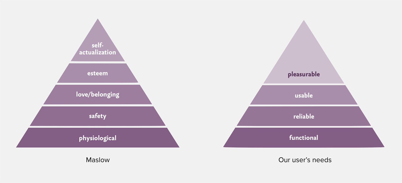
I used Maslow’s hierarchy of needs to describe the different steps of user experiences and how they would affect the user.

How does this relate to UX Design in the digital and physical world? Maslow gives us the method to understanding the needs of our users. Take online banking for an example:
-
Make the interface functional. It would mean the user being able to login, pay bills, and view an account summary.
-
Make it feel safe for the user to use. I don’t need to tell you how crucial that is for the banking industry and a user will refuse to use something that even APPEARS to be unsafe.
-
Make it usable. It needs to be easy to navigate between pages and it all the functions exactly as the user expects. Note: This is where 99% of all services end, but great UX design goes further.
-
Make it pleasurable. I know what you’re thinking – a pleasurable online banking experience? Crazy! It may seem laughable, but it’s only crazy until someone actually makes one. Then the whole industry will scramble to catch up.
Some of my favorite user experiences aren’t enjoyable in the sense that they offer bells and whistles or even amusing graphics like Mailchimp - although I’m a huge fan of their UX too. In fact, some of my favorite experiences take a vastly different approach. They choose to offer as much value as possible with as little friction as possible. An average consumer spends more than two hours per day on their phones and, if you’re anything like me, a lot of that remaining time is spent in front of a computer screen. While I do want that time to be enjoyable, I’m looking for tools that offer something else. Basically, I just want to get things done. Talking to Adobe, I mentioned Dropbox as a great tool that just works and that’s why I’m also not a big fan of them changing their branding. One of the best investments in my business throughout the years is my Doxie Go scanner. It’s something I use almost daily and while the software that comes along with it isn’t anything special, it does one thing very well. You want to know what that is? It just works. It’s fast, easy to understand and lightweight.
Sometimes we assume that in order to stand out and make an impression, we need to come blazing in when in fact to make a lasting, great experience it’s often the opposite.
Want to learn more?
Just talking about this has inspired me to relaunch User Experiences that Matter with a new landing page along with a free e-mail course for anyone interested in UX! Check it out!