I'm currently leading the "Design Principles" class for Hyper Island's UX Upskill Program.. This is part 3 out of 4. You can read Part 1 here, Part 2, and Part 4 here. This session was held by Patrick Sundqvist, a very seasoned designer whom I have the outmost respect for. These are my thoughts and reflections based on his session.
For a long time, moving from wireframes to visual design was considered the 'making the thing pretty' stage. The reality is, taking wireframes into visual designs is not about making things pretty, but rather about making things a pleasure to use and interact with.
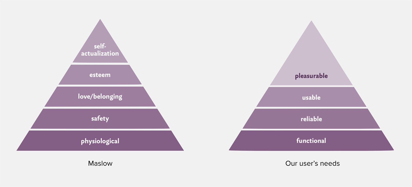
As we define requirements and constraints, we're making sure that what we're building will be functional and reliable. When creating wireframes, we order and arrange each feature in a way that's logical and user friendly so the product will be usable (note that usable and useful aren't the same thing).
During the visual design stage, we can make our product even more usable, but it also gives us an opportunity to make something that's a pleasure to use. It's important to remember that adding visual design doesn't me that the product will automatically be a pleasure to use. After all, everything we use have visual design (even wireframes have visual design, just... 'less' of it).

Pleasurability
If we look at ways we use visual design to make a product pleasurable we can use the different aspects of a user interface to find opportunities to delight.
- Form - Shapes allow us to communicate different things and inspire different emotions. Round shapes are considered to be more friendly vs shapes with sharper edges.
- Color - Colors are used to communicate throughout our society. It's important to understand that depending on geographical location, colors may communicate different things. In the Western world, we generally use red to communicate danger, green to communicate positive actions, and blue has long been considered a calming color.
- Typography - Type allows us to strengthen the message we want to send with form and color. Not just between serifs and sans-serifs, but also how we use capitalisation, bold typography, etc.
- Images - The old saying that an image is worth a thousand words surely has some truth to it. Images are an easy, efficient, and universal way to communicate with users.
- Animation - Animation can define a product and in many cases, a lack of animations can define a product even more (in a not so positive way). Animations are a great way of giving feedback back to the user - to clearly say that the product has understood our request and that it's acting upon it.
- Haptics - Haptics can act as a strengthener for cues from the user interface to the user. The way your smart watch buzzes to alert you or the way your phone prompts you when you pull to refresh.
Pleasurability is an extremely important aspect of a user interface.
As mentioned earlier, a user interface is not just there to make things look pretty, but rather serves important aspects of the user experience:
- Clarify - The user interface needs to clarify any uncertainties or doubts a user may have about the product and how it works.
- Guide - The user interface should guide the user to certain desired tasks and actions. A checkout flow should guide the user to finalizing their order and a messaging app should guide the user to send and receive messages.
- Explain - Furthermore, the user interface should explain how the product works and why it works that way.
- Fortify/Augment - Finally, the user interface should augment all of the above to reduce friction and remove confusion.
A user interface is like a joke.
If you have to explain it, it’s not that good.
In order to create good user interfaces, we've looked at the tools we have at our disposal to create good user interfaces, but, as with anything, the tools are worthless if we don't know what we want to achieve with them.
A good user interface is:
- Useful, relevant, and necessary - While want to make a product pleasurable to use adding visual cues just for the sake of it doesn't necessarily achieve our goals. A user interface needs to be useful, but even more importantly, relevant.
- Clear and intuitive - I think this is something everyone can relate to. A huge factor in Apple's success over the last two decades has been their ability to create user interfaces that are clear and intuitive.
- Simple to grasp and understand - Continuing on that note, interfaces need to be simple enough to grasp (high-level) and understand (in-detail).
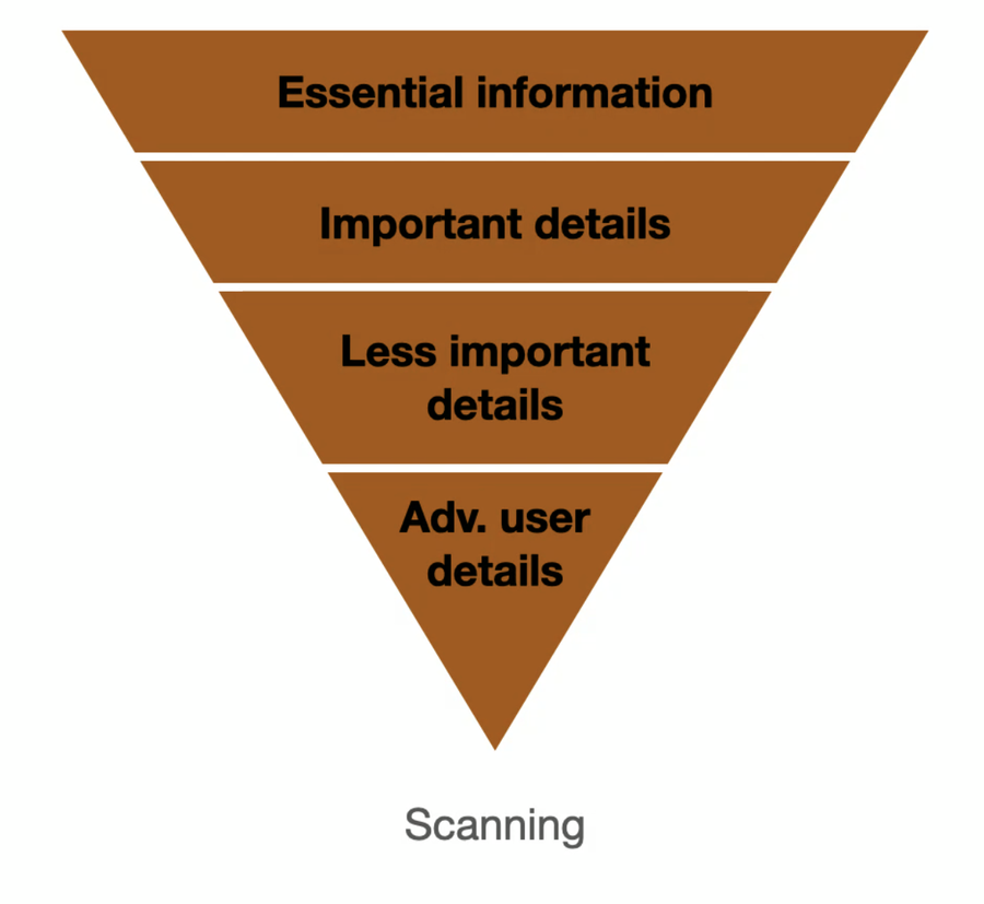
- Specific - easy to understand what is to be done - The user interface should be specific when needed, but always showcase essential information.
- Trustworthy - Regardless of what the product is, trust is key. As a user, I need to be sure that the actions I perform actually are executed and that the information is correct.
- Explorative - The key features and information need to be front and center while striving to educate users. It's important to have a user interface that's also explorative and allows them to explore new features and topics.

I'm currently leading the "Design Principles" class for Hyper Island's UX Upskill Program.. This is part 3 out of 4. You can read Part 1 here and Part 2 here. This session was held by Patrick Sundqvist, a very seasoned designer whom I have the outmost respect for. These are my thoughts and reflections based on his session.