I'm currently leading the "Design Principles" class for Hyper Island's UX Upskill Program. This is part 2 out of 4. You can read Part 1 here, Part 3, and Part 4 here.
When people ask what I do, I tell them I’m a UX-designer or that I lead UX. The reality is, these are not titles I’m a fan of. It’s true that I help companies design user experiences. While you’d think the title would be suitable, it also suggests that I am solely responsible for the complete user experience. As we talked about last week, the user experience is much larger than most assume and something impossible for one person to create.
Today we're going to start off by talking about the other half of the term UX-designer, namely designer. I hear a lot of people saying they don't know anything about design (even accomplished designers say this!). Years ago, I was listening to Erika Hall give a talk (I've since then had the honor of working with Erika, she is an amazing researcher) and she had this a slide that stuck in my mind ever since.
Design is a series of decisions.
It's a simple concept, but anyone that's ever worked on a design project knows just how true it is. One could easily argue that, you know, life is the same. Just a series of decisions.
But I think it'd be great if we could apply this mind space more often when designing products. After all, with any decision of importance we want to make, we tend to research the subject, right? We ask our friends or other people we trust what they think and, beyond that, what they believe. Do they have experience using the product? That's the logical starting point.
For some reason when it comes to design, we tend to just... start designing. We often approach the task of designing with the preface that "I'm not really a designer" or "I really don't know anything about design" and instantly set ourselves up for failure. Ultimately, design is just like any profession - you get better by practicing. So that's what we're going to do now!
I DON'T KNOW anything about design. Bullsh*t.
Look around you. You make choices based on design every day.
Even if you can’t design those things yourself, that doesn’t take away from your ability to decide that was the chair you wanted to sit on, or the shoes you wanted to wear, or the car you wanted to buy.
You know bad design when you encounter it. From every chair you’ve sat in that hurt your ass, to every coffee cup that burned your hand, to every time your finger triggered the wrong link on your phone, to every airline booking site that pissed you off. You know bad design. You hate it.Mike Monteiro - You're my favorite client
We DO make design decisions every day. And if you think about it, you have since you were a child. Maybe you drew up a football field in the dirt, maybe you came up with a game (that somehow only you could win) or perhaps you played your parents against each other to land a trip to Disneyland. You could easily define a goal. You knew whether or not you'd achieved it. When you did, you said that your plan has gone "as designed". That is design.
A designer isn't someone who makes pretty things in Figma or a similar tool. A designer is - or at least should be - someone who can help you solve problems in a way that you can't. Perhaps you were thinking design is some kind of black magic arts. I'm sorry to say it's not. It's not magic and it's not art. It's a craft. The craft of a designer is to solve a problem within a given set of constraints utilizing tools of the industry. Just like a doctor needs to know symptoms in order to practice their craft of diagnosing what's wrong or a chef needs to know the ingredients necessary to make a great dish, we need constraints as designers in order to solve a problem.
Today we're going to start by looking at how to set these constraints.
Product Requirements
Design is visualized thinking.
— Halli (@iamharaldur) August 25, 2020
I love Dribbble but it seems like many designers there aren’t thinking much of anything.
I'll start by giving you some career advice: One of the biggest shifts in the way I work as I’ve become more senior is the way and methods I use when I approach visual design.
In the early days of my career, I’d be happy to start designing by knowing what brand the site was for and maybe a rough outline of what the site should achieve; marketing site, corporate site, etc.
In the early 21st century, I wasn’t alone tackling projects this way. Fast-forward 20 years and you’d assume things in the field have changed, right? That designers approach projects in more thoughtfully and disciplined ways? The successful ones do.
Continuing on the career advice path, here's two more:
- You'll spend a lot of time trying to figure out if you're solving the right problem
- Once you get to Figma, most of the hard work is already done
Once you get to Figma, most of the hard work is already done. 👀 https://t.co/oEzG0FxLvx
— Sean Goodwin (@TheSeanGoodwin) August 19, 2020
The hard work is to make sure you are solving the right problem.
What a designer should focus on:
- The problem: What is the opportunity or issue that needs to change? What’s the history?
- Constraints: What do we know already? Where do we start exploring and unearthing more? What are our limits?
- People: Who are we doing this for and what matters to them?
- Craft: Less about the "project" and more about a designer’s own ability to be effective, efficient, and capable of communicating their ideas.
A great way to document and highlight the first three are through a Product Requirements Document, commonly known as a PRD. A PRD defines the value and purpose of a product or feature. It is written to communicate what you are building, who it is for, and how it benefits the end user. They help to provide an understanding of what products should do. It is advisable, however, that such a document does not concentrate on “how” the product should be developed. That way the developers are free to use their experience to work out the optimal solution for each requirement. Requirements documents should also describe the assumptions of the customer regarding your product.
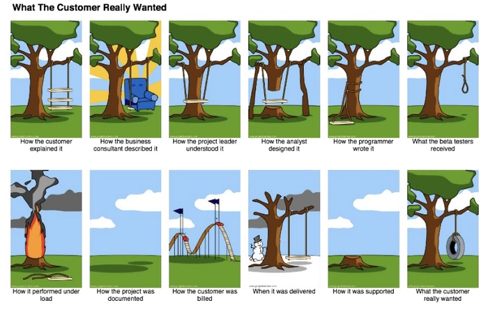
Without a PRD, it's easy to end up here:

The contents of the PRD can vary, but I think a certain set of parameters make sense to include:
- Features - The name of the feature
- Description - Description of the feature
- Purpose - What should be accomplished
- User problem - Pain points or challenges
- User value - Experience of using the products and its benefits to the user
- Assumptions - User, business, and technical assumptions
- Not doing - What is out of scope for a certain feature
- Acceptance criteria - A set of parameters determining whether a user story is complete and working
I've been working on a grocery delivery service for the last few months and a PRD for something as basic as a search function might look like this:
- Features - Search
- Description - Search by keyword, product name, category or brand
- Purpose - Giving the customer an accessible, easy-to-use way to find specific products
- User problem - Browsing categories too time consuming or unsure of which category a product belongs to
- User value - Ability to quickly find a specific product
- Assumptions -
- We assume that search will also serve product results based on tags such as gluten free, lactose free, organic, etc. and that the metadata will be in place to serve them up.
- We assume that search will be for products only and will not turn up things like store location. (For the store finder we will have a map with address search.)
- We will design the following search states: initiation, in-progress, results, results sorted, no results.
- Not doing - We are not designing for edge-cases
- Acceptance criteria - A user can search in the set language and receive appropriate results every time.
Wireframes
I do a fair bit of writing now. Sure, I was terrible at it in the beginning, but it's something that I've felt has helped me immensely as a designer.
Last year I wrote a post called "Why wireframes are becoming obsolete". It gained a bit of attention and has been read by ~30.000 people to date and a bit more than 3000 claps on Medium.
I outlined why I thought wireframes were becoming obsolete as we have design systems and better tools at our fingertips.
Ironically, I've primarily been designing wireframes for the last year.
First things first
A wireframe is a low-fidelity design layout that serves three simple, exact purposes:
- It presents the information that will be displayed on the page
- It gives an impression of the structure and layout of the page
- It conveys the overall direction and description of the user interface
Wireframes are a middle ground. They’re not sketches, but they’re not high fidelity designs either. They’re intentionally designed without color. A wireframe simply attempts to be an accurate representation of layout and information architecture while intentionally avoiding high visual and content fidelity. This is efficiency in process.
The key to a good wireframe
All you need to do is show how elements are laid out on the page and how the site navigation should work. You can add fancy images and flashy typefaces later. Minimize all distractions.
Keep these guidelines in mind:
- Keep your colors to grayscale: white, black, and the grays in between.
- Use a maximum of two generic fonts, maybe one serif and one sans-serif. Showing the hierarchy of information can be shown through changing the size of the font and its styling (bold, italics, etc.).
- No flashy graphics and images. Instead, try using simple rectangles and squares as placeholders with an “x” through the middle of the box to show where an image will be placed.
Why wireframes?
The purpose and argument for wireframes often fall in one of three buckets:
- Wireframes focus attention on usability instead of aesthetics. They prevent stakeholders from derailing meetings over irrelevant details like button color and allow user testing to focus on interactions instead of visuals.
- Wireframes are faster, more efficient to create. They keep things conceptual and avoid the risk of over-investment or attachment to a particular design direction.
- They’re a tool for detailed documentation of interactions without the additional overhead of visual design.
Three types of wireframes
Generally, I like to think there are three basic themes of wireframes; sketches, lo/mid-fidelity wireframes, and hi-fidelity wireframes.
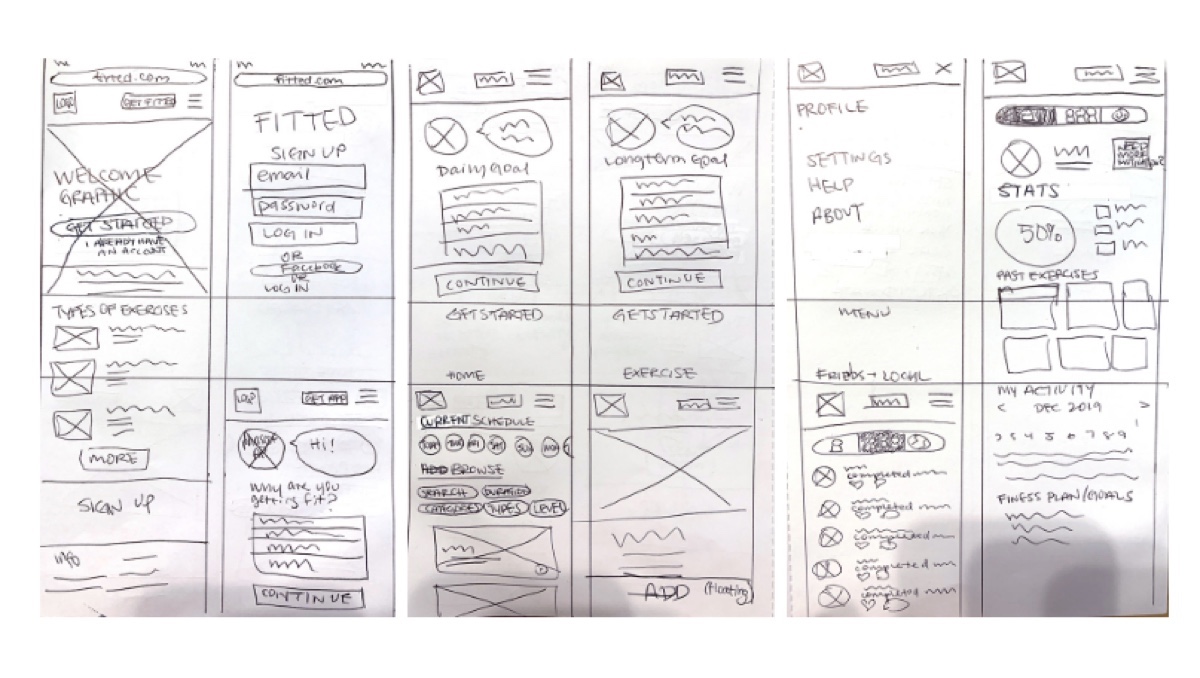
Sketches (lo-fidelity wireframes)
Using pen and paper to sketch is a great way to get started and aligning on hierarchy. It's beneficial to use directly with clients as it's impossible (hopefully!) to misinterpret as the final design - giving them a sense of where they are in the process.
They are fast and easy to create but the the downside is that making changes isn't ideal - nor is sharing.

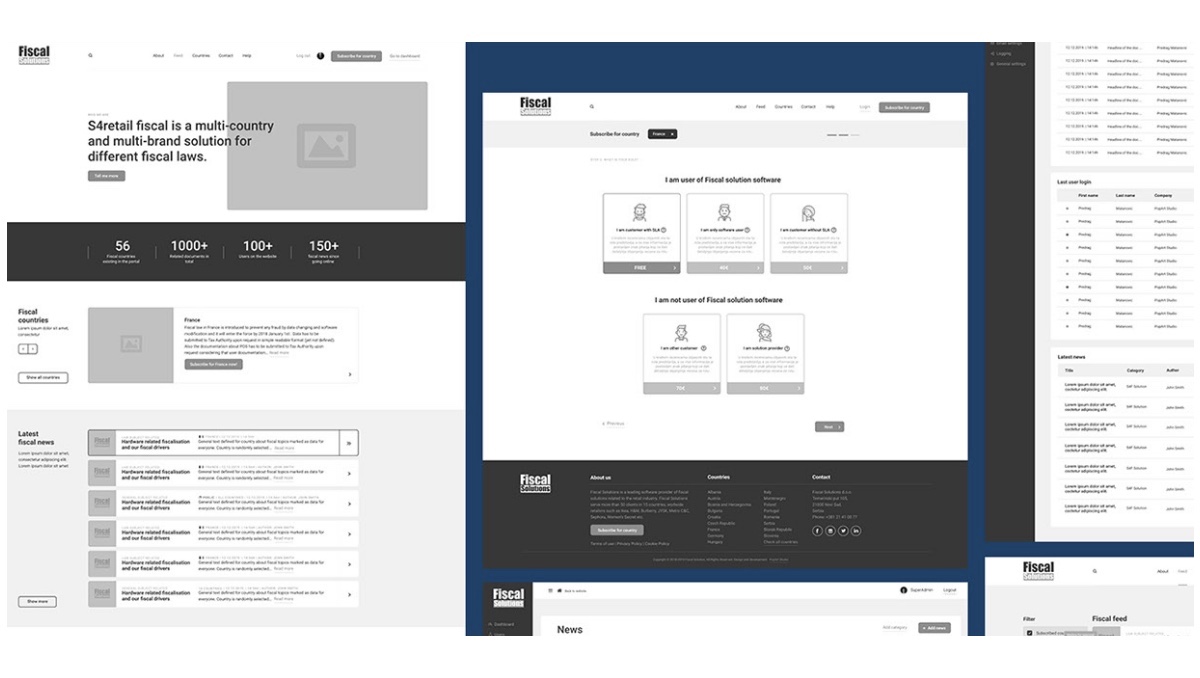
Mid-level wireframes
Mid-level wireframes are good for describing not just hierarchy but also giving a good glimpse of what the content is. It's still rough enough for (most) clients to understand that it's not the final design.
The challenge here is keeping it raw, while still communicating the precision necessary.

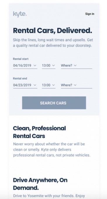
Hi-fidelity wireframes
Hi-fidelity wireframes are more detailed and give the client a strong idea of the visual representation of elements within the interface.
These are more time-consuming to create and runs a greater risk of the viewer assuming that it's the actual "design".
However, because they "look better", clients tend to have a more positive reaction to hi-fi wireframes.
Upon approval, it's far easier to apply this representation of visual design to a hi-fi wireframes compared to something sketched on a paper.

So are wireframes obsolete?
Wireframes are a tool. In some cases, it does make sense to make wireframes in order to more easily align on the overall purpose of a feature or product
Does every project require wireframes? Absolutely not.
It will always depend on the project scope, the project itself, the stated requirements, the client, and even the designer's process! Some designers prefer to work based off wireframes and other prefer to have something more loosely defined.
I'm currently leading the "Design Principles" class for Hyper Island's UX Upskill Program. This is part 2 out of 4. You can read Part 1 here and Part 3 here.