I'm currently leading the "Design Principles" class for Hyper Island's UX Upskill Program. This post is part of my introductionary talk about what UX is and through what lens we should look at UX. This is part 1 out of 4. You can read Part 2 here, Part 3 here and Part 4 here..
The baseline of this class is Design Principles, but we'll be focusing more on the fundamentals of the design process. By first focusing on the steps in the process, you'll be able to identity what's needed to create a great user experience.
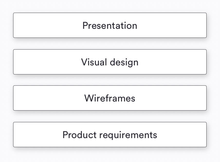
Product requirements - What, for who, why, what are the constraints, what are the requirements?
Wireframes - What is the structure? What are the high level features and logic that we're creating?
Visual design - What is the brand personality and identity? What are we trying to communicate with our visual design?
Presentation - How do we describe what this does in less than 5 minutes?
These are equally important, but... If you don't do each of the steps in the right order and complete them properly, you'll end up with a very shaky experience and app.
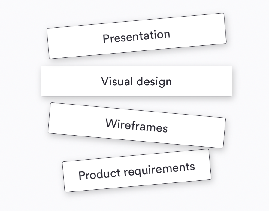
So over the next four weeks, I'll walk you through each of these steps. For today, I want to focus on the broader subject of what is UX. I believe it's fundamental that all of us start on a common idea and understanding of what a user experience is.
So what is UX?
With all the hype and attention that the term UX has got in the last few years, you'd imagine we'd be pretty aligned on what we mean when we talk about UX.
For a subject that should focus around simplifying, there sure are a lot of images trying to explain what user experience and only resulting in confusion.
Is UX a bowl of cereal? And UI is a spoon?
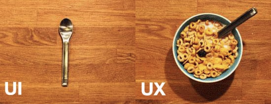
For years, this one floated around the Internet arguing that "Design" is what someone intended the usage to be and "User experience" is how users actually interact with the product.
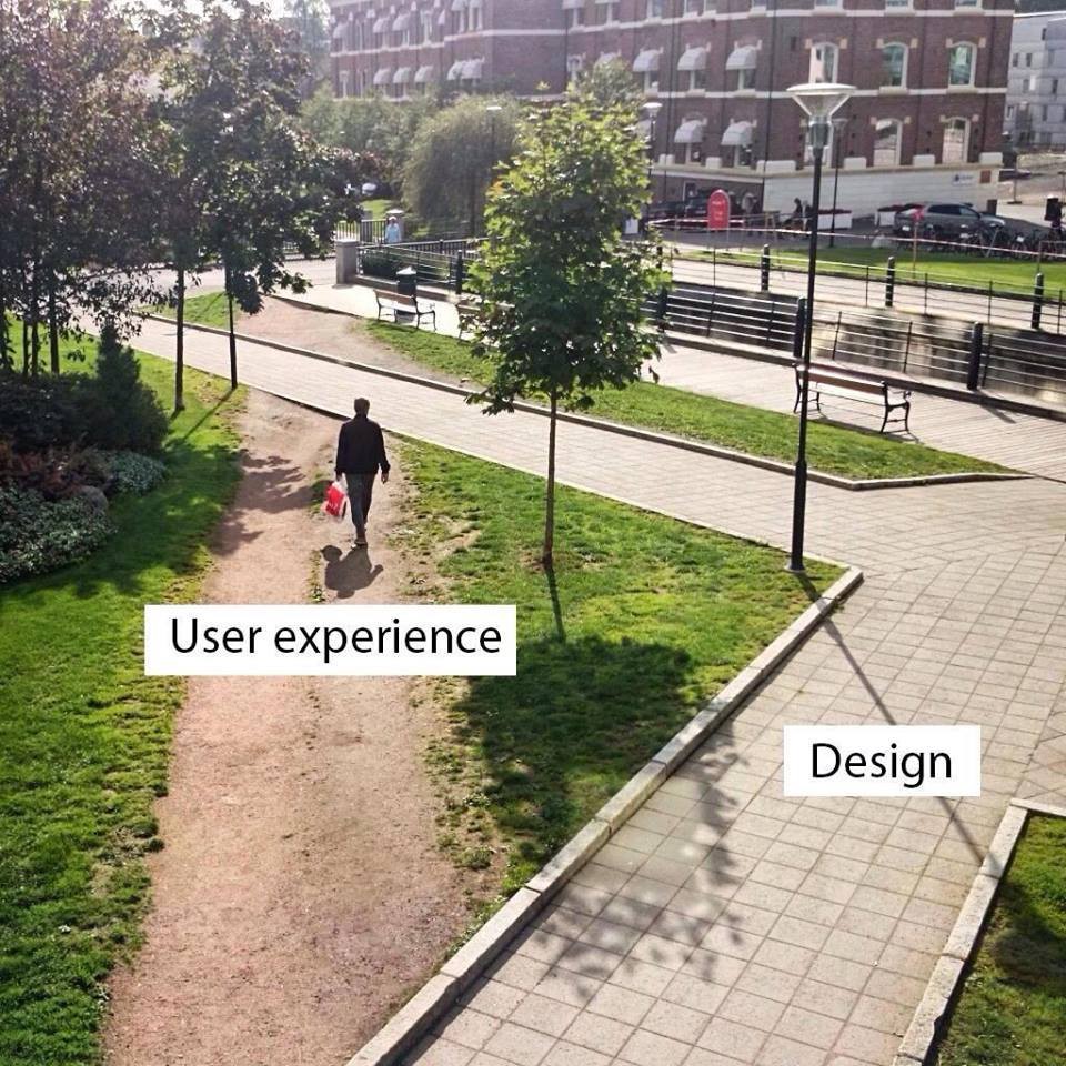
I think this image actually hits closer to home...
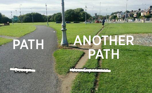
Choosing a dirt road over a paved one doesn’t describe a user experience, but can describe a user scenario - a pattern if you will. A user experience isn’t as black and white as these pictures want us to believe. They are both, in fact, expressions of different user experiences.
Let's look at a real life scenario for some context:
Everyone, every once in a while, has one of those days.
You know the kind of day I’m talking about: You wake up to sunlight streaming in your window and wonder why your alarm clock hasn’t gone off yet. You look over to see that your alarm clock think it’s 3:43 AM. You stumble out of bed to find another clock, which tells you that you can still make it to work on time — if you leave in 10 minutes. You turn on the coffeemaker and hustle to get dressed, but when you go to retrieve your dose of life-sustaining caffeine, there’s no coffee in the pot. No time to figure out why — you’ve got to get to work! You get about a block from your house when you realize that the car needs gas. At the gas station, you try to use the one pump that takes credit cards, but this time it won’t accept yours. So you have to go inside and pay the cashier, but first you have to wait in line while the cashier very slowly helps everyone in front of you. You have to take a detour because of a traffic accident, so the drive takes longer than you expected. It’s official: Despite all of your efforts, you are now late for work. Finally, you make it to your desk. You’re agitated, harried weary and irritable — and your day hasn’t even really started yet. And you still haven’t had any coffee.Jesse James Garrett - The Elements of User Experience
I think most of us can understand how a bad start to a day can result in a downward spiral. It may seem like bad luck on the surface - just one of those days, right? When we look closer, we see how each of the issues could have been avoided through intentional design of the products involved.
The clock started this whole mess. The alarm didn’t go off because the time was wrong. The time was wrong because in the middle of the night your cat stepped on it and reset it. A slightly different cat-proof configuration of buttons and you’d be awake in good time for work - coffee in hand.
The coffeemaker didn’t start because you didn’t push the button all the way down. The machine itself has no visual or audio cue that it’s been turned on - no light, no sound, and no resistance when the button pushes in. You thought you had turned it on, but being in a hurry, you didn’t double check it. This could have been avoided if you had set the coffeemaker to start brewing automatically in the morning, but you never learned how to use that function — let’s face it, none of us do.
The credit card didn’t work at the pump because there was no infographic or visual guide defining which way the card should be inserted. Because you were in a hurry, you didn’t think of trying all orientations.
The line at the gas station moved slowly because the cash register was overly complex and confusing. The clerk spent extra time making sure he was correct rather than run the risk of having to start the transaction from scratch - a real possibility. The popularity and simplicity of registers like iZettle and Square is no coincidence.
The accident happened because the driver momentarily took his eyes off the road while he turned the radio down. He had no choice but to look down because it was impossible to identify the volume control by touch alone. So much for futuristic touch-screens!
Each one of these instances of ‘bad luck’ could have been avoided if only someone had made better choices while designing the products. Take a look around you right now. It’s frightening how many of the products we interact with daily haven’t taken the user into account when they were created. So clearly UX is a field that can have an enormously high impact on improving the lives of those who use the products we design.
"User experience" encompasses all aspects of the end-user's interaction with the company, its services, and its products.Don Norman
User Experience is not about the inner working of a product or a service. Instead, User Experience is about how it works on the outside, where a person comes in contact with it. When someone asks you what it’s like to use a product or a service, they’re asking about the user experience. Is it hard to do simple things? Is it easy to figure out? How does it feel to interact with the product?
To me, this consists of three main areas:
- Visual design - Not long ago, this is what most people assumed was the user experience. How things look. Even when Material Design concepts were first launched, the discussion was primarily focused around how it looked, not how it should be adapted, combined with words, or the interaction!
- Content design - During the last year, there’s been more and more discussion about the importance of UX writing (even by yours truly). This is not just because of a sudden trend, but more because words play a crucial role informing the user of the user experience. Written content is a great way to add personality, but also a way to remove friction and insecurity - the stepping stones of good UX.
- Interaction design - How a button interacts with you when you hover over it or press it is not merely visual design or eye candy its a way for the application to communicate with you - "I’m responding to your actions" - and ideally, "I’m responding to them quickly." Secondly, interaction design is related to information architecture - how the service is structured.
Let's look at the two paths again

Here’s what’s wrong with this image Both of the paths provide a user experience. They provide the user with different user experiences. The dirt path is a shorter path and great in ideal conditions. The concrete path is longer, but is a better choice when it’s raining and you don’t want to jump mud puddles.
Both of these paths are designed. The paved path is designed by engineers deliberately and the other one was designed by users.
Therefore, the picture is misleading and totally fails to explain what UX is, and for no reason whatsoever, puts Design and UX in conflict, and even more so, it smirks and with a smug look puts UX in superior position to Design.
Design is a process, a method, a toolkit, a verb (to design) which is used by people to create various User Experiences. Design is a method, and UX is a desired outcome — outcome based on user research, heuristics, gut intuition, requirements, etc. These two cannot be confronted like the picture suggests. It’s not even apples vs. oranges comparison, these are both at least fruit, it’s apples vs. rockets level of comparison.DEBUNKING BAD DESIGN MEMES, PART 1: “DESIGN VS. UX” INFAMOUS PICTURES
The difference between UI and UX
So hopefully we're a little bit more aligned on what we mean when we talk about UX. To take things to the next level, let's take a quick look at what UI is and more importantly, how it relates to UX as these are often intertwined and exchanged randomly.
So putting this as simply as I can UX design aims to achieve:
- To improve customer satisfaction;
- To improve the quality of interaction between a company and its consumer;
- To make sure that the product, whether that be a website, app or software program, logically flows from one step to the next;
UI design on the other hand aims to:
- Translate the work of a UX designer be it research, wireframes and what not into an attractive, guiding and responsive experience.
- Use visual elements in a consistent way so users can guide themselves easier by understanding the visual design system at play.
I'm currently leading the "Design Principles" class for Hyper Island's UX Upskill Program. This post is part of my introductionary talk about what UX is and through what lens we should look at UX. This is part 1 out of 4. You can read Part 2 here and Part 3 here.