Artists have the freedom to pursue new ways of creating art in ways that designers don’t. While innovation is encouraged for designers, we need to first focus on creating solutions that feel intuitive for the user based on their past experiences. That doesn’t leave us a lot of room for creating new ways of solving problems.
The past decade has demonstrated the Internet’s ability to grow and change. That’s why it’s so surprising how every new redesign looks just like everything else that’s out there. It doesn’t matter if it’s flat or material design, mobile-first or image-centric, there are clear trends that our design processes force us to follow.
The artists among us
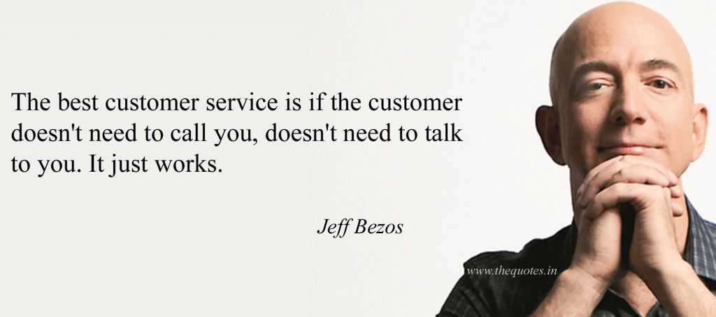
This past week, news broke that Amazon is purchasing Whole Foods. Amazon, by itself, is an extraordinary thing, to say the least. From selling books to selling basically everything, it’s on a path to become the world’s biggest company and making it’s founder Jeff Bezos, the world’s richest man. Thinking of new ways of creating industry drives Amazon towards even more success. It’s like how an artist views their art.
So what made Jeff act more like an artist than a designer?
“When you think like everybody else thinks, don’t be surprised when you get what everybody else gets. Divergent thinking, and action pays in business and investing. Jeff Bezos clearly demonstrated his early divergent thinking in this presentation. While others viewed the early internet’s boom and bust as akin to the gold rush, Bezos saw the evolution of the electric industry as a better analogy. This mental model provided him the proper framework to be “incredibly optimistic” about the internet’s, and his, future while everyone else was depressed.”
Bill Hewlett and Dave Packard said, “The biggest competitive advantage is doing the right thing at the worst time.” Bezos was doing the right thing at the worst time – being incredibly optimistic of the internet’s future and investing accordingly.

The challenge
If we as designers push the boundaries too far, no one will use our products because they don’t understand them. On the other hand, if we don’t push the boundaries enough and play it safe from start to finish, we lose our advantage. With today’s low production costs, there’ll be thousands of copies out the next day that will do exactly what our product does.
The trick is to find the right balance between innovation that’s grounded in psychology and gestures that we are already familiar with. One feature that I always thought was innovative, but felt intuitive enough to quickly get traction was the iPhone’s slide to unlock feature.
It was different enough from the standard pin-code unlocking system while offering a physical movement that was clear and instantly relatable. Respecting the old while introducing the new paid off for Apple and created a feature that was recognizable for many design iterations. So, instead of inventing everything from the start, pay attention physical and psychological patterns of your users, re-use what they are comfortable with, and then place them in new contexts. Like Jeff said, “When you think like everybody else thinks, don’t be surprised when you get what everybody else gets. Divergent thinking, and action, pays in business and investing”.